
How to Resize Images Without Losing Quality: A Complete 2026 Guide

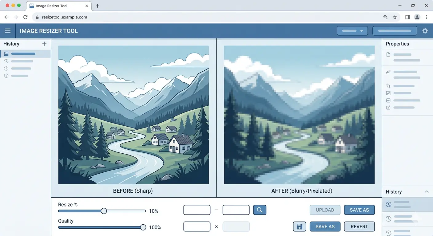
Every resize changes what's in the file, and which way you go decides how badly.
Going smaller is the forgiving direction. Pixels get thrown out, fine detail goes with them, yet at the size people view the image it still looks a lot like the original. For web use that's fine.
Enlarging is where things go wrong. Nothing in the file hides extra detail, so the software smears the pixels it has across a bigger area, and the picture turns soft.
Coming up: what resizing does to pixels, how to choose a format, browser and desktop methods, the habits that ruin quality, and sizing for different screens. I'll be blunt about the mistakes, since they cause most of the damage.
What happens when you resize an image?
A photo is just a grid of pixels, and a 1000 by 500 one holds half a million. Resizing builds a different grid. Shrinking averages neighbouring pixels together. Enlarging means inventing pixels nobody recorded.
The averaging has a name, interpolation. Bicubic and Lanczos are the two you'll run into, and either one shrinks a photo well. I slightly prefer Lanczos because edges stay sharper. Nearest-neighbor is the rough option: awful on photos, perfect for pixel art.
Direction beats method, in my book. Halving a photo rarely looks bad. Doubling a small one never looks good, whichever method you pick.
Which format should I use?
Format matters too. Every JPEG save costs a little more detail, so a file passed through four edits looks worn. PNG keeps all the data and any transparency, though the files get heavy. I use WebP for anything going online, since it's small and handles transparency. AVIF is smaller again, but a few browsers can't open it. Resize first, convert last.
PNG or JPEG? PNG vs JPG walks through which fits which job. As a loose guide, photos suit JPEG or WebP, while screenshots, logos and sharp text suit PNG or WebP.
Order matters. Convert first and shrink afterwards and you've compressed twice. Resize once from the original, convert once, finished.
What quality setting should I choose?
JPEG and WebP give you a quality slider, and people love to max it out. Resist. The last stretch adds plenty of kilobytes for a gain no one will spot. Start around the middle, compare against the original at the size it will display, and raise it only if edges around text look rough.
PNG has no slider. A PNG that's too heavy needs shrinking or a format change, since there's nothing to tweak.
How do I resize an image in the browser?
MeloTools has a free image resizer that runs in your browser through the Canvas API, so your files stay on your own machine. Handy for client screenshots and personal photos.
- Drag one in.
- Type in a width and height, and don't touch the lock on the ratio.
- Peek at the preview.
- Pick the output format.
- Download.
Several images? Ten fit in one session, and you can download them as a ZIP or one at a time.
Keep the ratio locked unless you've got a reason not to. With it locked, changing one side should carry the other along. A preview that looks stretched usually means the lock got switched off by accident.
With the size sorted, the image compression tool can trim the file a bit more.
How do I resize on the desktop?
Desktop options exist as well. In Windows Photos, Resize is behind the three dots. Mac users go through Preview: Tools, then Adjust Size. In GIMP it's Image, then Scale Image, and I'd switch interpolation to Lanczos before exporting.
Each has quirks. Preview handles one file nicely and a folder badly. Windows Photos is fine for a quick job. GIMP offers the most control and the steepest climb.
Always save under a new name. Overwrite the original and the clean copy is gone, which hurts when you need a different size next month.
Where does it go wrong?
A squashed photo means the aspect ratio was unlocked. Mush means somebody scaled past the original dimensions. A JPEG that looks tired has been saved too often. Resizing a copy of a copy does the same thing, because every generation loses detail. Fix that by going back to the original file and resizing once. Still editing? Keep it as PNG or WebP until you're done.
Sizing for the wrong target is a quieter mistake. A photo cut for a blog column looks fine on a laptop and soft on a high-density phone screen. Pixel density explains why, and I'll get to it next.
Then there's compression piled on compression: resize, compress, convert, compress again. Every pass takes a bit more. Decide the order up front and run it once. Our guide to reducing image file size without losing quality shows a sensible way.
How big should the image be?
Size the image for where it appears. An 800 pixel blog column wants an 800 pixel image on a standard screen and roughly 1600 pixels on a screen with double the pixel density. Past that, you're shipping weight nobody sees.
Not sure which sizes fit your layout? Best image sizes for blogs offers starting points.
Don't guess the size, measure it. Inspect the image in developer tools and compare the displayed size with the file's real dimensions. If the file is three times wider than it ever shows, that's easy savings.
How do I serve the right size to each screen?
Think about a 5000px upload on a page that shows 800px: the browser downloads all of it for nothing. Resize before uploading. Add srcset and sizes so small screens get small files, and run a compressor over the result for a little more. Then set width and height on the image tag. Without them the layout lurches as the page loads, and Cumulative Layout Shift is the score for that lurch.
Like so:
<img
  src="photo-800.webp"
  srcset="photo-400.webp 400w, photo-800.webp 800w, photo-1600.webp 1600w"
  sizes="(max-width: 600px) 100vw, 800px"
  width="800" height="533"
  alt="Describe the photo here"
  loading="lazy">
The srcset attribute names each file and its width. The sizes attribute says how wide the image will be shown, which lets the browser pick before layout is done. Width and height hold the space open, keeping CLS down. Google calls 0.1 or less good.
Add loading="lazy" to anything below the fold. The hero image is the exception, because you want it early. Srcset, sizes and the picture element and the lazy loading beginner guide cover the rest.
Making three sizes takes one tool. Run the original through the resizer once per width, and label the files so you can tell them apart. A few minutes of work, and every visit benefits.
When is it fine to make an image bigger?
Now and then you can't avoid it: a client sends a 600 pixel logo and the layout wants 1000. A modest bump is tolerable. Flat artwork with clean edges copes better than a photo does.
Stretch gently. Ten or twenty percent hides well. Twice or three times the size doesn't. If the image matters, ask for the original or a higher resolution export, because software won't rescue it.
Vectors are the way out. An SVG logo scales to any size and loses nothing, so ask for one.
Quick checklist before you hit download
Before you download, check five things. Is the ratio locked? Is the target size at or below the original? Did you start from the original, not a copy of a copy? Is the format suited to the job, with WebP or PNG if you need transparency? Does the preview look crisp at display size?
All yes? Download. Any no? Fix it first, because redoing the work costs more.
FAQ
Does resizing reduce quality?
Yes, a bit, though you'd rarely notice. Shrinking an image means throwing pixels away, so tiny details disappear, but at normal viewing size it still looks like the original to most eyes. JPEG and WebP lose a little more depending on the quality slider. PNG has no slider, so the pixels you remove are the only cost.
Can I make an image bigger?
You can, but don't expect miracles. The tool just stretches the pixels it already has, so the result looks softer, and it warns you when your target is bigger than the original. There's a hard cap of 16384 pixels per side. If you need something larger and sharp, go back and find a bigger source file.
What are the limits?
Ten images per session, and each one can be up to 10 MB. You can load JPEG, PNG, WebP or AVIF files, and there's no sign-up. Nothing leaves your browser either. Past ten files, just finish the batch and open a fresh session. That's the whole list of rules, really.
Which formats can I save as?
You can save as Original, JPEG, PNG or WebP. Pick Original and JPEG and PNG files stay as they were, while WebP or AVIF files come out as WebP, because AVIF output isn't offered. Transparency survives in PNG and WebP. JPEG paints transparent areas white, so use PNG or WebP for logos.
Is the resizer free?
Yes, completely, and nobody needs an account. Everyone gets the same limits: 10 images per session and 10 MB each. Download results one at a time or bundle them as a ZIP. Since everything runs in your browser, there's nothing to install, which is part of why I like it.
Should I resize before or after compressing?
Resize first, then compress. Cutting the dimensions removes far more weight than any compressor can, and a smaller picture compresses more cleanly too. Switching format? Do that last. Work from the original each time and avoid stacking passes, because stacked passes are where the quality quietly drains away.
Related Guides
Image Sitemap XML: A Complete Guide to Getting Your Images Indexed by Google
Build an image sitemap Google will process, wire it into Next.js or WordPress, and check whether it moved the needle on image indexing in Search Console.
Wix Image Optimization: What Wix Does Automatically and What You Must Do Yourself
Wix handles more image optimization than most platforms, but it's not enough on its own. Learn exactly what Wix does automatically and the pre-upload steps that still matter.
Webflow Image Optimization: Pre-Upload Workflow and Built-In Settings
Master Webflow image optimization in 2026. Learn the pre-upload workflow, WebP conversion settings, CMS image configuration, and Core Web Vitals impact in one guide.
How to Check Image File Size Before Uploading (and Why It Matters)
Learn how to check image file size before uploading and why it matters for speed, SEO, and Core Web Vitals. Includes size thresholds, Lighthouse audit steps, and a free pre-upload checker.
Free Image Converter: Convert JPG, PNG, WebP, AVIF Online
MeloTools is a free image converter that runs entirely in your browser — no upload, no watermark, no account. Convert JPG, PNG, WebP, AVIF, and HEIC instantly. Try it free.
Image Optimization for WordPress: Complete 2026 Guide
WordPress sites lose rankings due to unoptimised images. This complete 2026 guide covers WebP conversion, compression plugins, Core Web Vitals fixes, and the exact settings that make WordPress images fast.