Best Image Sizes for Blogs in 2026: A Practical Guide for Speed, SEO, and Quality
Introduction
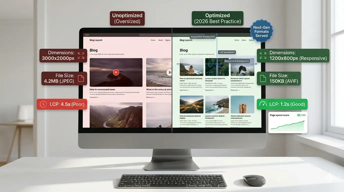
Choosing the best image size for a blog still trips up even experienced teams. Despite faster networks, better browsers, and smarter tooling, images remain one of the biggest contributors to slow pages, poor Core Web Vitals, and inconsistent SEO performance.
In 2026, image optimisation is no longer about uploading a "good enough" JPEG and moving on. It is about understanding image dimensions, layout behaviour, and page speed tradeoffs across devices. This guide breaks down what actually works today — based on how browsers, Google, and modern blog platforms handle images — so you can make decisions that scale.
Why Image Size Still Breaks Modern Blogs
Most blogs don't fail because of bad content. They fail quietly because of bloated assets.
Large, poorly sized images:
- Delay Largest Contentful Paint (LCP)
- Increase Time to Interactive (TTI)
- Cause layout shifts when dimensions aren't defined
- Waste bandwidth on mobile devices
The result is slower page speed, weaker rankings, and frustrated readers. Each of these metrics — LCP, CLS, and TTI — maps directly to a Google ranking signal. The full breakdown of how image decisions affect each Core Web Vitals score is covered in the guide to how image optimisation improves Core Web Vitals.
The challenge isn't compression alone. It's choosing the right image dimensions for how images are displayed, not how they're uploaded.
How Browsers and Google Handle Blog Images in 2026
There is no single "perfect" image size anymore. Modern browsers dynamically choose images based on viewport width, device pixel ratio (DPR), network conditions, and responsive image rules (srcset, sizes).
Google evaluates the rendered image size rather than the original upload size, the LCP candidate image dimensions, whether images block rendering, and layout stability (CLS) during loading. This means your blog images must be sized for layout context, not just aesthetics. How srcset and sizes attributes instruct the browser to select the right image for each device is explained in the complete guide to responsive images for beginners.
Best Image Sizes for Blogs (By Use Case)
Instead of chasing one magic number, think in terms of maximum display width.
Featured Images / Hero Images
These images often become the LCP element — the single largest visible element Google uses to measure perceived load speed.
Recommended dimensions:
- Width: 1200–1600px
- Height: proportional (avoid fixed heights)
- File size target: under 200KB after optimisation
This range covers most desktop viewports, allows responsive downscaling for mobile, and prevents oversized hero images from hurting page speed. Avoid uploading 4000px-wide images "just in case."
In-Content Blog Images
Used to support reading, not dominate layout.
Recommended dimensions:
- Width: 800–1200px
- Height: auto
- File size target: under 150KB
For text-heavy blogs, images rarely render larger than 800px. Anything bigger is wasted bytes.
Full-Width Blog Images
Used in editorial or design-heavy blogs.
Recommended dimensions:
- Width: 1600–1920px
- File size target: under 250KB
These require careful compression and responsive handling. Full-width images without srcset are among the most common page speed killers in production blogs.
Thumbnails and Preview Images
Used in category pages, related posts, and search results.
Recommended dimensions:
- Width: 300–600px
- File size target: under 50KB
Never reuse large blog images as thumbnails — this is one of the most common hidden performance issues and a direct cause of avoidable LCP and CLS failures.
Social Sharing Images
Recommended dimensions:
- 1200 × 630px (Open Graph standard)
Social images should not automatically be used as featured blog images unless resized properly. They serve a different purpose and are sized for a different container.
Image Dimensions vs Page Speed: What Actually Matters
Page speed doesn't care how sharp your image looks on a 5K monitor. It cares about bytes delivered vs pixels displayed.
Key performance relationships:
- Oversized images inflate LCP directly
- Missing width and height attributes cause CLS
- High-resolution images without responsive rules waste mobile bandwidth
- Compression alone doesn't fix bad sizing — a large WebP is still large
A 50KB image displayed at the right size beats a 200KB "high-quality" image every time.
Common Image Size Mistakes Bloggers Still Make
Uploading Original Camera or Design Exports
Modern cameras export images at 4000px+. Blogs rarely need more than 1600px. Uploading originals without resizing is the fastest path to a failing LCP score.
Relying Only on Format Conversion
Switching to WebP or AVIF significantly reduces file size — WebP by 25–35% over JPG, AVIF by up to 50% — but image dimensions still matter independently. A large AVIF can still be too large for its display context.
Ignoring Mobile Viewports
Most blog traffic is mobile-first. Desktop-sized images served to phones destroy page speed and waste bandwidth on connections where every kilobyte counts.
Using One Image Size Everywhere
Hero images, thumbnails, and inline images should never share the same dimensions. Each use case has its own display width and therefore its own optimal file size ceiling.
Forgetting Image Stability
Images without explicit width and height attributes cause layout shifts as the page loads, directly hurting CLS scores and user trust.
How Image Size Choices Turn Into Real Page Speed Problems
Poor image sizing leads to LCP scores above 2.5s, unstable layouts during load, increased crawl resource usage, and lower engagement metrics. Google doesn't penalise images directly — it penalises slow experiences caused by them. Image size decisions made during content production directly determine whether a page passes or fails Core Web Vitals thresholds.
SEO Impact Beyond Page Speed
Image sizing affects more than performance. Poorly handled images reduce Google Images visibility, waste crawl budget, lower perceived content quality, and hurt accessibility when alt text is rushed or generic. The full set of technical signals that determine image indexing and ranking — from file naming to structured data — is covered in the technical SEO guide for images.
Correct image dimensions improve render efficiency, image indexing accuracy, and user experience signals that Google uses as indirect ranking inputs.
Practical Guidelines for Choosing the Best Image Size Blog-Wide
Instead of guessing, follow a repeatable process.
Step 1: Define Maximum Content Width
Check your blog layout. Most content areas are between 720px and 900px wide. That number — not your screen size — should guide your image dimensions.
Step 2: Set Logical Image Size Tiers
Create size categories for hero, content, thumbnail, and social. Each tier should have a defined max width and file size target.
Step 3: Enforce File Size Ranges
Not hard limits, but consistent guidelines:
- Thumbnails: under 50KB
- Content images: under 150KB
- Hero images: under 250KB
Step 4: Use Responsive Images Properly
Ensure your CMS outputs correct srcset, accurate sizes attributes, and explicit width and height values on every image element. These three attributes together prevent the most common causes of CLS and wasted bandwidth.
Step 5: Optimise for Perceived Quality
A slightly softer image that loads instantly beats a perfect image that loads late. The goal is the lowest file size at which quality degradation is not humanly visible — which is almost always a lower quality setting than most teams default to.
Tooling and Workflow Considerations
Most image problems are process issues, not technical ignorance. Teams struggle when images are optimised manually, sizing rules aren't documented, and designers and developers work in silos. MeloTools exists to make image optimisation repeatable instead of reactive — compressing and converting images directly in the browser for free without uploads, logins, or inconsistent results across team members.
Final Checklist: Best Image Size Practices for 2026
- Define max layout widths before setting image dimensions
- Resize images before uploading — never upload camera originals
- Use responsive images (
srcset,sizes) everywhere - Set explicit
widthandheightattributes on all images - Match image size to use case: hero, content, thumbnail, social
- Monitor LCP and CLS regularly after publishing
- Treat image optimisation as a workflow, not a one-off task
Conclusion
The best image size for a blog in 2026 isn't a fixed number. It's the result of understanding layout, devices, and performance tradeoffs. Most image optimisation mistakes don't come from lack of skill — they come from lack of process.
When you build repeatable, performance-safe image workflows, you don't just improve page speed. You improve SEO stability, user experience, and long-term scalability. Think in systems, not pixels — and your blog will load faster, rank better, and age gracefully.