Webflow Image Optimization: Pre-Upload Workflow and Built-In Settings
Webflow image optimization is one of the highest-impact improvements you can make to a Webflow site's performance. Images are consistently the largest contributors to page weight on Webflow projects, and unoptimized images directly cost you in Largest Contentful Paint scores, Core Web Vitals failures, and organic search ranking. The good news is that Webflow provides meaningful built-in tooling, and a disciplined pre-upload workflow makes the platform's native features significantly more effective.
This guide covers both layers: what you should do before an image reaches Webflow's asset panel, and how to configure Webflow's built-in settings to get the best output from every image you publish.
TL;DR
- Pre-upload compression is the single highest-impact step in any Webflow image optimization workflow. Webflow's built-in tools work best when starting from already-optimized source files.
- Webflow automatically generates responsive image variants for inline images but not for background images. Understanding this distinction shapes your entire upload strategy.
- The built-in Webflow image conversion tool converts JPEG and PNG assets to WebP or AVIF directly in the asset panel. Always back up originals before converting.
- Webflow CMS image settings require explicit alt text field configuration in collection schemas to achieve consistent optimization across dynamic content.
- Image optimization is the fastest route to improving Webflow Core Web Vitals scores, particularly LCP and CLS, which are direct ranking signals in Google Search.
Why Webflow Image Optimization Requires a Two-Stage Approach
Webflow handles several image optimization tasks automatically: it generates responsive variants for inline images, applies lazy loading by default to below-the-fold images, and serves assets through a global CDN. These are meaningful defaults. But they are not substitutes for pre-upload optimization.
When you upload a 4MB JPEG and let Webflow generate responsive variants, you get responsive variants of a 4MB JPEG. The CDN delivers those variants quickly, but the base file size still affects Time to First Byte, decode time, and LCP. Starting from a compressed, correctly formatted source file means every downstream Webflow process operates on better raw material.
The two stages are:
- Pre-upload: Resize to display dimensions, compress, and convert to the correct format before the file touches Webflow's asset panel.
- In-Webflow: Use the platform's conversion tool, configure CMS fields, set alt text, manage lazy loading exceptions, and handle background images correctly.
Both stages are required. Skipping either one leaves measurable performance on the table.
Stage 1: The Pre-Upload Workflow
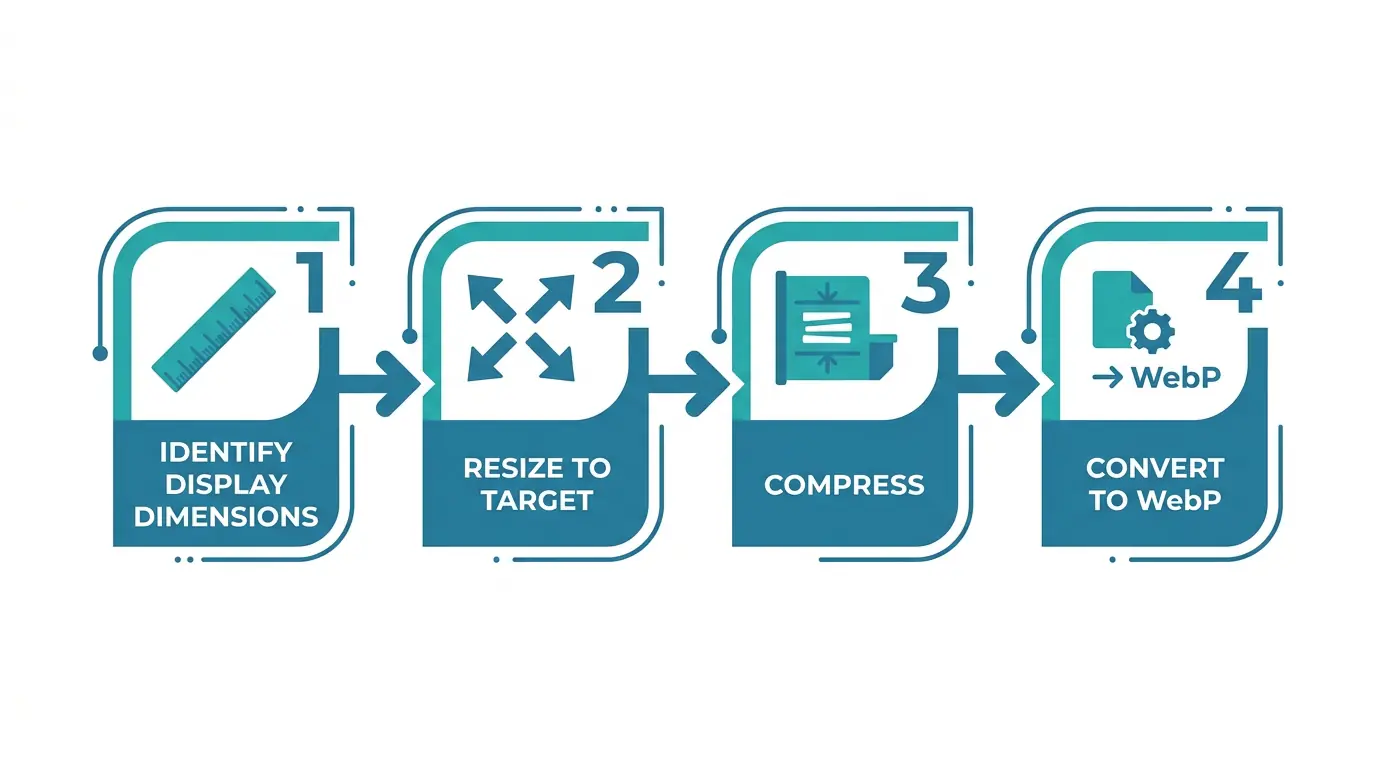
Step 1: Identify the Maximum Display Dimension
Before compressing anything, establish the largest size at which each image will be displayed across all breakpoints. A hero image on a full-width Webflow section typically renders at a maximum of 1400 to 1920 pixels wide on desktop. A blog thumbnail might render at 400 pixels wide. There is no reason to upload a 4000px image for a 400px container.
Check your Webflow designer across all breakpoints (desktop, tablet, mobile landscape, mobile portrait) and note the largest pixel width at which each image appears. That is your target upload dimension. Anything wider adds file weight without adding visual value.
For retina displays, a 2x multiplier is common practice. A container that displays at 400px CSS width should receive a source image of 800px if you want crisp retina rendering. Beyond 2x, the returns diminish. A 3x or 4x multiplier rarely justifies the file size cost for web delivery.
Step 2: Resize Before Compressing
Resize first, then compress. Compressing a 4000px image and then relying on HTML or CSS to display it at 400px is one of the most common image optimization mistakes in Webflow projects, and in web development generally.
Use MeloTools' browser-based image resizer to resize to your target dimensions without uploading anything to a server. The resize happens entirely in your browser, which means your source files remain private and the process works for client images, proprietary photography, and any content you cannot send to third-party servers.
Lock the aspect ratio before entering dimensions to prevent distortion. If you are preparing a batch of images for a Webflow CMS collection, establish consistent dimensions across the batch before moving to compression.
Step 3: Compress to the Right Quality Target
After resizing, compress the image. The target quality depends on content type:
Photographs and hero images: 75 to 85 percent quality in JPEG or WebP delivers strong visual fidelity at significantly reduced file size. The difference between 85% and 100% quality is often invisible to the eye but doubles the file size.
Product images with fine detail: 80 to 90 percent quality is a reasonable starting point. Zoom in on edges and fine texture areas after compressing to check for artifacts before uploading.
Logos, graphics, and images with flat color areas: Use PNG (lossless) or WebP lossless. Lossy compression on flat graphics introduces banding artifacts at color transitions that are immediately visible.
UI screenshots and diagrams: WebP lossless or high-quality WebP lossy (85%+) preserves text legibility and fine lines without the file size overhead of uncompressed PNG.
The MeloTools image compression tool handles all of these scenarios in-browser, with quality controls for each format. For batches of CMS images, the batch image compression tool processes multiple files in a single session, keeping file sizes consistent across an entire image set before they enter Webflow.
Target file size benchmarks for Webflow uploads:
| Image type | Recommended max file size |
|---|---|
| Full-width hero image | Under 200KB |
| Blog post featured image | Under 150KB |
| CMS collection thumbnail | Under 80KB |
| Product image (e-commerce) | Under 120KB |
| Logo / SVG equivalent | Under 30KB |
These are practical targets, not hard limits. Complex photographic content may require slightly higher thresholds. The key principle is that every kilobyte above these benchmarks should be a deliberate decision, not a default.
Step 4: Choose the Right Format Before Uploading
Webflow's built-in image conversion tool can convert JPEG and PNG to WebP or AVIF after upload, but converting before upload gives you more control over quality settings and lets you verify the output before it enters your asset panel.
WebP is the recommended format for most Webflow images in 2026. Browser support is universal, file sizes are 25 to 35 percent smaller than equivalent JPEG at the same visual quality, and Webflow handles WebP assets without any additional configuration.
AVIF provides even better compression than WebP, often 30 to 50 percent smaller than equivalent JPEG. It is particularly effective for photographic content. AVIF encoding is slower than WebP but the output quality at low file sizes is significantly better. Browser support is now universal across Chrome, Firefox, and Safari.
SVG should be the default for any vector content: logos, icons, illustrations, and diagrams. SVG files scale perfectly to any resolution, are typically under 10KB, and require no compression workflow. If you are using rasterized PNG exports of vector artwork in your Webflow project, switching to SVG is an immediate performance improvement.
PNG remains appropriate for images that require pixel-perfect transparency and cannot be served as SVG or WebP lossless. Keep PNG for UI element screenshots and graphics where compression artifacts at color edges are unacceptable.
Use MeloTools' PNG to WebP converter to convert source PNG files to WebP before uploading. The converter runs entirely in-browser with quality controls, and the output file can be verified visually before it enters your Webflow asset panel.
Stage 2: Webflow's Built-In Image Optimization Settings
Webflow's Automatic Responsive Image Variants
When you upload an inline image in Webflow and place it on the canvas as an image element (not a background image), Webflow automatically generates multiple responsive variants at different resolutions. These variants are served via srcset, and the browser delivers the appropriate size based on the visitor's screen width and resolution.
This is a significant built-in performance benefit, but it only applies to inline image elements. Background images set on sections, divs, or containers do not receive this treatment. For background images, Webflow serves the original uploaded file to all devices, regardless of screen size.
The practical implication: if you need an image to fill a full-screen section on mobile and desktop, using it as a CSS background will deliver the full-size file to mobile users. Use inline image elements with object-fit: cover wherever possible, and upload breakpoint-specific background image variants for sections where a background image is the only viable option.
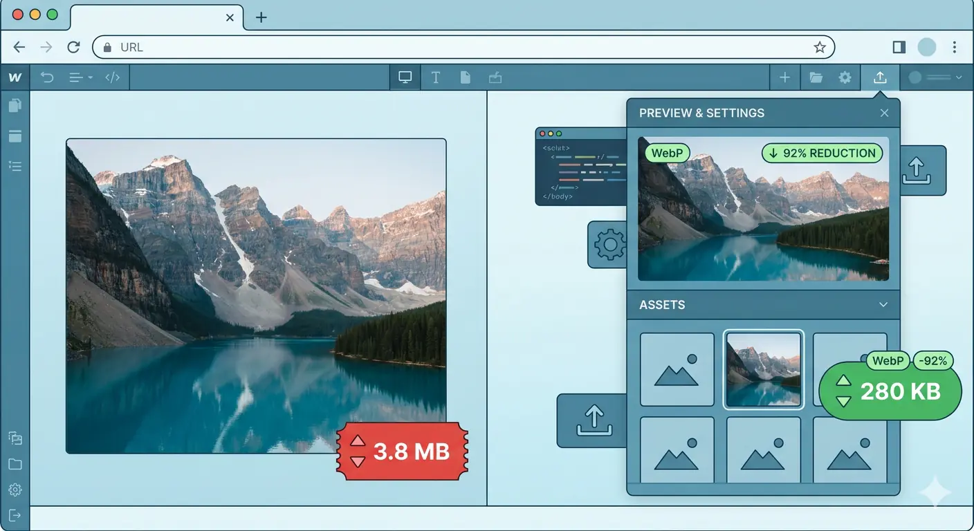
The Webflow Image Conversion Tool (WebP and AVIF)
Webflow's built-in image conversion tool converts existing JPEG and PNG assets in your asset panel to WebP or AVIF. Access it from the asset panel by selecting one or more assets (up to 100 per request) and choosing the conversion option.
Key points to know before using it:
The conversion is irreversible within Webflow. The original file is replaced by the WebP or AVIF file. Download your originals from the asset panel or create a site backup before running the conversion. If an asset fails to convert, it is likely already compressed as much as possible.
WebP and AVIF files converted through Webflow are not supported as OpenGraph images. If any of the assets you are converting are used as OpenGraph images for social sharing, do not convert those assets. Keep JPEG or PNG versions for OG images.
After converting assets, republish your site. The conversion updates the files in the asset panel and on the canvas, but the CDN will not serve the new versions until you publish.
Webflow CMS Image Settings
Webflow CMS image settings require deliberate configuration to achieve consistent image optimization across dynamic content. Unlike static image elements, CMS images are managed through collection schemas, and each image field must be configured individually in the collection template.
Setting up alt text fields: In your CMS collection settings, add a text field specifically for alt text alongside each image field. Name it clearly, for example "Featured Image Alt Text" paired with "Featured Image." In the collection template, connect the alt text text field to the alt text attribute of your image element. This ensures every CMS item has a unique, editable alt text value rather than inheriting a generic default or leaving the field empty.
Image dimension constraints in CMS: CMS images in Webflow do not enforce upload dimension limits. This means contributors adding content through the CMS editor can upload any image size. Establish and document upload guidelines for content contributors: maximum file size (under 200KB for featured images), recommended pixel dimensions, and preferred format (WebP where possible). Without documented guidelines, CMS collections accumulate inconsistently sized images over time, degrading performance gradually across the site.
Rich text image handling: Images embedded in Webflow rich text fields are not individually controllable through the designer. They are uploaded inline during content editing. Include image optimization instructions in any rich text field usage guidelines, and use MeloTools to compress images before pasting them into rich text editors.
Lazy Loading and LCP Configuration
Webflow applies loading="lazy" to images by default in recent versions. This is the correct behavior for images below the fold: lazy loading defers their download until they approach the viewport, reducing initial page weight and improving Time to Interactive.
The critical exception is your Largest Contentful Paint element. The LCP element is typically the hero image or the largest above-the-fold image on the page. Lazy loading the LCP image delays its download and directly increases your LCP time, which is a Core Web Vitals failure.
In Webflow, you can override lazy loading on individual image elements. Select the image element, open the element settings panel, and set loading to "Eager" for your hero images. This tells the browser to prioritize downloading that image immediately on page load.
As a rule of thumb: the first image visible without scrolling on desktop and mobile should have eager loading. Every other image on the page should use lazy loading.
Webflow Core Web Vitals: What Images Control
Webflow Core Web Vitals performance is substantially determined by image optimization decisions. Images affect all three primary Core Web Vitals:
Largest Contentful Paint (LCP): LCP measures how long the largest visible element takes to render. On most Webflow sites, this is a hero image. A compressed, correctly formatted hero image under 150KB with eager loading will produce significantly better LCP than a 2MB JPEG with default lazy loading. Google uses LCP as a direct ranking factor. A score under 2.5 seconds is the target.
Cumulative Layout Shift (CLS): CLS measures unexpected layout movement during page load. Images without explicit width and height attributes cause layout shift because the browser does not reserve space for them before they load. In Webflow, always set explicit dimensions on image elements or use aspect ratio padding to reserve space. CLS failures are often traced directly to images loading and pushing content down the page. Target CLS under 0.1.
Interaction to Next Paint (INP): INP measures responsiveness to user interaction. Images that are excessively large cause high decode overhead, which can block the main thread and delay interaction responses. Large uncompressed images uploaded directly to Webflow without pre-processing are a common source of INP degradation, particularly on mobile.
A pre-upload workflow that enforces the file size benchmarks in Stage 1 of this guide will produce measurable Core Web Vitals improvements on most Webflow sites within a single publishing cycle.
The Complete Webflow Image Optimization Checklist
Use this checklist for every new Webflow project and for auditing existing sites:
Pre-upload:
- Identify maximum display dimension across all breakpoints for each image.
- Resize to display dimensions (2x for retina) before uploading.
- Compress to target quality level using MeloTools browser-based compression.
- Convert to WebP or AVIF before uploading where possible.
- Verify visual quality at 100% zoom before uploading, paying attention to edges and fine detail.
- Confirm file size is within benchmark (under 200KB for hero images, under 80KB for thumbnails).
In Webflow:
- Use inline image elements instead of CSS background images wherever possible.
- Set eager loading on the first above-the-fold image (LCP element) on every page template.
- Define explicit width and height on all image elements to prevent CLS.
- Configure alt text fields in every CMS collection schema that includes an image field.
- Use the built-in conversion tool to convert any remaining JPEG/PNG assets to WebP.
- Back up original files before running the built-in conversion tool.
- Do not convert OG images to WebP or AVIF.
- Upload breakpoint-specific variants for any background images used in full-width sections.
- Republish the site after running any asset conversions.
After publishing:
- Run a Lighthouse audit on key page templates (homepage, blog post, collection page) and review LCP, CLS, and INP scores.
- Use PageSpeed Insights to check if any images are still flagged under "Serve images in next-gen formats" or "Properly size images."
- If LCP is above 2.5 seconds, identify the LCP element and verify it has eager loading and is under 150KB.
- Set a quarterly audit cadence for CMS collections to catch oversized contributor-uploaded images before they compound.
Frequently Asked Questions
Does Webflow automatically optimize images on upload? Webflow automatically generates responsive size variants for inline image elements and serves them through a global CDN with lazy loading enabled by default. However, it does not automatically compress or convert your source files on upload. A 3MB PNG uploaded to Webflow will be served as a 3MB PNG (in responsive variants) unless you compress it before uploading or use the built-in conversion tool to convert it to WebP or AVIF. Pre-upload compression using a tool like MeloTools image compressor is the step that makes Webflow's built-in optimization most effective.
What is the best image format for Webflow in 2026? WebP is the recommended format for most Webflow images in 2026. It delivers 25 to 35 percent smaller file sizes than JPEG at equivalent visual quality, browser support is universal, and Webflow handles WebP natively in the asset panel. AVIF is the better choice for photography and hero images where maximum compression matters most, and its browser support is now universal across Chrome, Firefox, and Safari. Use SVG for all vector content. Keep JPEG or PNG only for OpenGraph images, which Webflow does not support in WebP or AVIF format.
How do I configure Webflow CMS image settings for alt text? In your CMS collection settings, add a plain text field alongside each image field and label it as the alt text field for that image. In the collection template in the designer, select the image element bound to that image field, open the element settings, and bind the alt text attribute to the alt text text field from the collection. This creates a unique, editable alt text value for every CMS item. Without this configuration, CMS images either have no alt text or a static generic value, which affects both accessibility and image SEO.
How do Webflow WebP images affect Core Web Vitals? Webflow WebP images directly improve Largest Contentful Paint by reducing the file size of the image the browser must download before the LCP element can render. A hero image at 150KB WebP will produce a significantly faster LCP than the same image at 800KB JPEG. WebP images also reduce decode overhead, which benefits Interaction to Next Paint on mobile. The combination of WebP format and eager loading on the LCP element is the single most effective image-related Core Web Vitals improvement on most Webflow sites.
Why is my Webflow site still failing Core Web Vitals after switching to WebP? The most common reason is that the LCP image still has lazy loading enabled. Switching format reduces file size but lazy loading delays the download regardless of format. Set the LCP image element to eager loading in the Webflow designer. The second most common reason is that background images on sections are not generating responsive variants, meaning mobile users download the full desktop-sized image. Use the MeloTools image resizer to create mobile-specific variants and upload them as breakpoint background image overrides in Webflow's section settings.
Can I use MeloTools to optimize images before uploading to Webflow? Yes. MeloTools processes all image optimization entirely in your browser, with no file uploads to external servers. The image compression tool handles quality-controlled lossy and lossless compression. The PNG to WebP converter converts source files to WebP before they enter Webflow's asset panel. The image resizer resizes images to your exact display dimensions with aspect ratio locking. For CMS image batches, the batch compression tool handles multiple files in a single session. All tools work directly in the browser, making them safe for client files and proprietary photography.