Responsive Images Explained: srcset, sizes and the picture Element
Responsive images in HTML solve a problem that sounds simple but has multiple moving parts: serving the right image size to the right device without manual logic in JavaScript. The srcset attribute, the sizes attribute, and the <picture> element are three distinct tools that work together — but each does a different job, and confusing them is the most common implementation mistake.
This guide covers all three precisely: what each one does, when to use which, and the exact code patterns for common real-world scenarios including WebP fallbacks and the Next.js Image component.
The Problem Responsive Images Solve
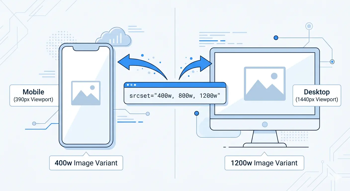
Without responsive images, every device downloads the same image file regardless of screen width. A mobile phone with a 390px screen downloads the same 1200px wide JPEG as a desktop monitor — the browser scales it down visually, but the full file size transfers regardless.
The HTTP Archive measures this problem across millions of real websites. Images account for over 50% of average page weight, and a significant portion of that weight is pixel data that is scaled away and never displayed. Responsive images address this directly: the browser downloads only the image size it actually needs.
The second problem responsive images solve is display density. A retina screen (2× or 3× pixel density) renders images at double or triple physical pixels. A 400px wide image on a 2× screen uses 800 physical pixels — serving a 400px image produces a blurry result. Responsive images allow serving 800px images to retina screens while 400px screens get the 400px version.
The srcset Attribute — Offering Size Choices
The srcset attribute on an <img> element provides the browser with a list of available image variants and their widths. The browser then chooses which variant to download based on the current viewport width and device pixel ratio.
<img
  src="image-800w.jpg"
  srcset="image-400w.jpg 400w,
          image-800w.jpg 800w,
          image-1200w.jpg 1200w"
  alt="Descriptive alt text"
>
The 400w, 800w, and 1200w values are width descriptors — they tell the browser the intrinsic width of each image file in pixels. This is not a CSS instruction; it is information the browser uses in its selection algorithm.
Without a sizes attribute (covered in the next section), the browser assumes the image will display at 100% of the viewport width. For a 390px viewport, it would select the 400w variant. For a 1024px viewport, it would select the 1200w variant. This default assumption is often wrong — most images are not full viewport width — which is why sizes is almost always required alongside srcset.
The src attribute remains required as a fallback for browsers that do not support srcset. Use the medium-size variant here — it is the most likely to be appropriate if srcset is not processed.
The sizes Attribute — Telling the Browser How Wide the Image Will Display
The sizes attribute corrects the browser's default assumption that the image is viewport-wide. It describes how wide the image will actually render at different viewport breakpoints, using CSS media queries with length values.
<img
  src="image-800w.jpg"
  srcset="image-400w.jpg 400w,
          image-800w.jpg 800w,
          image-1200w.jpg 1200w"
  sizes="(max-width: 640px) 100vw,
         (max-width: 1024px) 50vw,
         800px"
  alt="Descriptive alt text"
>
Reading this sizes value:
- On viewports up to 640px wide: the image displays at 100% of the viewport width
- On viewports between 640px and 1024px: the image displays at 50% of the viewport width
- On viewports wider than 1024px: the image displays at exactly 800px
The browser evaluates these conditions from top to bottom and uses the first match. The final value (800px) is the default — no media query — applied when none of the conditions above match.
With this information, the browser can calculate which srcset variant to download before the image loads. For a 390px viewport (mobile), the sizes says the image is 390px wide — the browser selects the 400w variant. For a 768px viewport at 1× density, the image is 384px wide — 400w variant again. For a 768px viewport at 2× density (retina), the image needs 768px of pixel data — the 800w variant is selected.
The critical rule: sizes values must reflect your actual CSS layout. If your CSS sets max-width: 800px on the image's container, the sizes default should be 800px — not 100vw. Incorrect sizes values cause the browser to download the wrong variant, wasting bandwidth or serving blurry images.
img srcset Multiple Sizes — A Complete Real-World Example
Here is a complete responsive image implementation for a blog post featured image in a layout where the image is full-width on mobile, contained within an 800px article column on desktop:
<img
  src="featured-800w.jpg"
  srcset="featured-400w.jpg 400w,
          featured-800w.jpg 800w,
          featured-1200w.jpg 1200w,
          featured-1600w.jpg 1600w"
  sizes="(max-width: 800px) 100vw, 800px"
  width="800"
  height="533"
  loading="lazy"
  alt="Description of the featured image content"
>
Key points in this implementation:
Four size variants — 400w, 800w, 1200w, 1600w cover 1× and 2× display needs across mobile (390px = needs 400w or 800w for retina) and desktop (800px column = needs 800w or 1600w for retina).
width and height attributes — required to prevent Cumulative Layout Shift (CLS). The browser reserves the correct amount of space before the image loads, preventing content jumping. Always include these — the values match the intrinsic dimensions of the largest srcset variant.
loading="lazy" — defers loading of below-the-fold images until they are near the viewport. Never apply this to hero images or the LCP element — it delays the most important image on the page. Apply to all other images.
The <picture> Element — Format Fallback and Art Direction
The <picture> element serves two distinct purposes that are often conflated:
Purpose 1 — Serving modern formats with fallbacks (the most common use case)
The browser selects the first <source> element whose type it supports and uses that image. Browsers that do not support AVIF skip to the WebP source. Browsers that do not support WebP skip to the <img> fallback.
<picture>
  <source
    srcset="image-400w.avif 400w, image-800w.avif 800w, image-1200w.avif 1200w"
    sizes="(max-width: 800px) 100vw, 800px"
    type="image/avif"
  >
  <source
    srcset="image-400w.webp 400w, image-800w.webp 800w, image-1200w.webp 1200w"
    sizes="(max-width: 800px) 100vw, 800px"
    type="image/webp"
  >
  <img
    src="image-800w.jpg"
    srcset="image-400w.jpg 400w, image-800w.jpg 800w, image-1200w.jpg 1200w"
    sizes="(max-width: 800px) 100vw, 800px"
    width="800"
    height="533"
    loading="lazy"
    alt="Description of the image content"
  >
</picture>
This is the picture element WebP fallback pattern in full production form. Browsers that support AVIF (~94% of global traffic) get the most efficient format. WebP serves as the primary fallback (~97% total coverage). JPEG handles legacy browsers.
The <img> element inside <picture> is required — it is the fallback, carries the alt attribute, width, height, and loading attributes, and is the element that actually renders the image regardless of which <source> is selected.
Purpose 2 — Art direction (different images at different viewport sizes)
Art direction means serving a different crop or composition of an image at different screen sizes — not just a different file size of the same image. A landscape photo with a subject on the left works on desktop but may need a tighter square crop for mobile.
<picture>
  <source
    media="(max-width: 640px)"
    srcset="hero-mobile.webp"
    type="image/webp"
  >
  <source
    media="(max-width: 640px)"
    srcset="hero-mobile.jpg"
  >
  <source
    srcset="hero-desktop.webp"
    type="image/webp"
  >
  <img
    src="hero-desktop.jpg"
    width="1200"
    height="630"
    alt="Hero image description"
  >
</picture>
Use media attributes on <source> elements for art direction. Use type attributes for format fallbacks. Use both together when needed.
Preparing Responsive Images Before Using srcset
Before writing any srcset markup, the images themselves need to exist at each width. Generating multiple width variants from a single source — resizing to 400px, 800px, 1200px, and converting to WebP and AVIF — is the prerequisite step.
MeloTools image converter handles the WebP and AVIF conversion step entirely in the browser — no upload, no server, no account. The workflow for preparing a full responsive image set:
- Start with the highest-quality source image — typically 1600px or 2× your maximum display width
- Convert to WebP using JPG to WebP converter or PNG to WebP converter
- Convert to AVIF using JPG to AVIF converter for the AVIF source set
- Compress each variant using MeloTools image compressor — Balanced preset (quality 80) for photographs
- Generate width variants using your image processing pipeline or manual resize
A typical blog post featured image set after this workflow:
image-400w.webp— approximately 40–80KBimage-800w.webp— approximately 90–160KBimage-1200w.webp— approximately 150–250KBimage-1600w.webp— approximately 220–380KB
The total set is 500–870KB — compared to a single 1.2MB unoptimised JPEG that every device would download without responsive images.
The Next.js Image Component — Responsive Images Without Manual srcset
The next.js image component responsive implementation handles srcset generation, WebP/AVIF conversion, lazy loading, and CLS prevention automatically — removing the need to manually write any srcset markup.
import Image from 'next/image'

export default function BlogPost() {
  return (
    <Image
      src="/images/featured.jpg"
      alt="Description of the featured image"
      width={800}
      height={533}
      sizes="(max-width: 800px) 100vw, 800px"
      priority={false}
    />
  )
}
What Next.js Image does automatically:
- Generates WebP and AVIF variants of your source image on demand
- Creates multiple width variants (matching your
sizesvalue and common breakpoints) - Writes the full
srcsetand<picture>element markup - Adds
loading="lazy"for non-priority images - Prevents CLS by reserving space using the
widthandheightprops - Serves images from the
/\_next/imageoptimisation endpoint
The sizes prop is the only manual input that requires thought — it must match your CSS layout exactly, just as with hand-written srcset. If your article column is 800px wide on desktop and full-width on mobile, sizes="(max-width: 800px) 100vw, 800px" is correct.
For above-the-fold and LCP images, set priority={true}:
<Image
  src="/images/hero.jpg"
  alt="Hero image description"
  width={1200}
  height={630}
  sizes="100vw"
  priority={true}
/>
priority={true} adds rel="preload" to the document <head>, telling the browser to start loading this image as early as possible — directly improving LCP scores. Never use priority on below-the-fold images — it wastes bandwidth and reduces the LCP benefit for images that actually need it.
For images with unknown dimensions (fill layout):
<div style={{ position: 'relative', width: '100%', height: '400px' }}>
  <Image
    src="/images/background.jpg"
    alt="Background image"
    fill
    style={{ objectFit: 'cover' }}
    sizes="100vw"
  />
</div>
The fill prop removes the requirement for explicit width and height props — useful for background images and fluid containers where dimensions are determined by CSS. The parent element must have position: relative.
Common srcset Implementation Mistakes
Using srcset without sizes. Without sizes, the browser assumes the image is viewport-wide and selects incorrectly for images in multi-column or constrained layouts. Every srcset implementation should include sizes unless the image genuinely is always full-viewport-width.
Incorrect sizes values that don't match CSS. sizes must reflect the rendered width of the image in your actual CSS layout. If your CSS puts the image in an 800px-wide container at all viewport sizes, sizes="100vw" is wrong — it causes the browser to download far larger images than necessary.
Not including width and height attributes. Without these, the browser does not know the image's aspect ratio before it loads — causing CLS. Always include these on <img> elements and Next.js <Image> components.
Applying loading="lazy" to LCP images. Lazy loading defers image loading until the element is near the viewport — if the LCP element is lazy-loaded, the browser delays its most important image intentionally. Use loading="eager" or Next.js priority={true} for hero and LCP images.
Forgetting the JPEG fallback in <picture>. The <img> fallback is required inside <picture>. Omitting it or placing it outside the <picture> element causes rendering failures in browsers that do not support any <source> format.
For a complete guide to the formats used in responsive image source sets and when to use each, the best image format for web in 2026 covers AVIF, WebP, PNG, and JPEG with specific file size benchmarks. For the relationship between responsive images and Core Web Vitals scores specifically, the guide to image optimization and Core Web Vitals covers LCP, CLS, and the technical signals Google measures.
Frequently Asked Questions
What is the difference between srcset and the picture element?
srcset on an <img> element offers the browser a choice of image sizes — the browser selects based on viewport width and device pixel ratio. The <picture> element gives the developer explicit control over which image loads: either for format fallbacks (AVIF → WebP → JPEG) or art direction (different crops at different viewports). Use srcset for resolution switching, <picture> for format fallbacks and art direction.
What should I put in the sizes attribute?
The sizes attribute must reflect how wide the image actually renders in your CSS layout. If your content column is 800px wide on desktop and full-width on mobile, the correct value is sizes="(max-width: 800px) 100vw, 800px". Use browser DevTools — inspect the rendered image width at each breakpoint and build your sizes value from those measurements.
Does Next.js handle srcset automatically?
Yes. The Next.js Image component generates srcset and <picture> markup automatically, serves WebP and AVIF variants, adds lazy loading, and prevents CLS — all from a single <Image> component. The only required manual input is the sizes prop, which must reflect your CSS layout accurately. Set priority={true} for LCP images.
Should I use srcset for every image on my page?
Use srcset for any content image that is displayed at varying widths across different screen sizes — hero images, featured images, product photos, and editorial content images. Skip it for icons, logos at a fixed small size, and decorative images where the file size difference between variants is negligible.
How do I generate multiple image width variants?
For static publishing workflows, resize your source image to each required width using an image editor, then convert each variant to WebP and AVIF using a free browser-based converter like MeloTools image converter. For dynamic applications, Next.js generates variants automatically on demand, or use an image CDN like Cloudinary or Imgix that generates width variants via URL parameters.