How Image Optimization Improves Core Web Vitals
How Image Optimisation Improves Core Web Vitals (Complete Guide 2026)
Core Web Vitals are Google's three primary page experience metrics — Largest Contentful Paint (LCP), Cumulative Layout Shift (CLS), and Interaction to Next Paint (INP). All three are confirmed ranking signals in Google Search. All three are directly and significantly affected by how images are optimised, sized, formatted, and delivered.
This guide explains the precise relationship between image decisions and each Core Web Vitals metric: the thresholds that determine Good, Needs Improvement, and Poor scores; the specific HTML attributes that improve or degrade each metric; and the format and compression choices that determine how fast images load. It is the reference that every other image optimisation article on this site links to for Core Web Vitals detail.
TL;DR
- LCP is most often caused by an unoptimised hero image. Fix: compress + convert to WebP/AVIF + add
fetchpriority="high"- CLS is most often caused by images without
widthandheightattributes. Fix: always set dimensions- INP is affected by large images blocking the main thread during decode. Fix:
decoding="async"+ lazy load off-screen images- All three metrics improve when images are compressed, correctly sized, and delivered in modern formats
How Google Measures Core Web Vitals
Google measures Core Web Vitals using real-world data from Chrome users (Chrome User Experience Report / CrUX). PageSpeed Insights and Google Search Console both surface these scores with the thresholds below. Lighthouse uses lab data rather than field data — useful for testing, but PageSpeed Insights field scores determine ranking impact.
| Metric | Good | Needs Improvement | Poor |
|---|---|---|---|
| LCP | < 2.5 s | 2.5–4.0 s | > 4.0 s |
| CLS | < 0.1 | 0.1–0.25 | > 0.25 |
| INP | < 200 ms | 200–500 ms | > 500 ms |
A page must reach "Good" on all three metrics to pass the Core Web Vitals assessment. A single failing metric holds the entire page back regardless of how well the other two score.
Largest Contentful Paint (LCP) and Images
What LCP Measures
LCP measures the time from navigation start until the largest visible element in the viewport has finished rendering. In practice, the LCP element is an image on the majority of pages — hero images, featured blog images, product photographs. For these pages, LCP is almost entirely determined by how fast that image loads.
How Image File Size Directly Sets LCP Time
The browser must download the LCP image before it can render it. On a typical mobile connection (approximating 3G / 4G mixed), the relationship between image file size and LCP time is roughly:
| LCP Image File Size | Approximate LCP (Mobile) | Score |
|---|---|---|
| < 100 KB | ~0.8–1.2 s | ✅ Good |
| 100–250 KB | ~1.2–2.0 s | ✅ Good |
| 250–500 KB | ~2.0–3.5 s | ⚠️ Borderline |
| 500 KB–1 MB | ~3.5–6 s | ❌ Poor |
| > 1 MB | ~6–12 s | ❌ Poor |
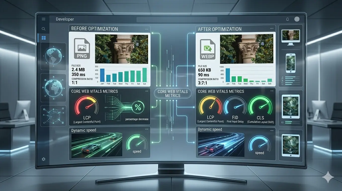
A 1.2 MB PNG hero image — common in sites that upload directly from design tools — will produce Poor LCP on mobile connections for a significant proportion of real visitors. Converting that image to WebP at quality 82 typically produces a 300–400 KB file. Converting to AVIF produces 160–220 KB. The LCP improvement is direct and measurable. The complete compression guide covers how to achieve these reductions with the specific quality settings and format decisions for each image type. The AVIF vs WebP comparison covers when AVIF's additional compression gain is worth the implementation complexity.
The Most Commonly Missed LCP Attribute: fetchpriority
The browser's default resource loading priority assigns images a lower priority than stylesheets and scripts. This means the LCP image — the most important element on the page for perceived speed — often begins downloading later than it should, even if it is in the initial HTML.
The fetchpriority="high" attribute signals to the browser that this image should be loaded at the highest possible priority, pre-empting other resources:
<img
  src="hero.webp"
  alt="Descriptive alt text"
  width="1200"
  height="600"
  fetchpriority="high">
Apply fetchpriority="high" to exactly one image — the LCP element. Do not apply it to multiple images; this negates the priority signal by treating multiple resources as equally critical.
rel="preload" for LCP Images in CSS Backgrounds
If the LCP element is a CSS background image rather than an <img> element, the browser cannot discover it until the stylesheet has parsed and the CSS has applied. By that point, significant time has passed. A <link rel="preload"> in the <head> tells the browser to fetch the image as early as possible:
<link rel="preload" as="image" href="hero.webp" type="image/webp">
For <img> elements in HTML, fetchpriority="high" is sufficient. For CSS background images used as hero visuals, rel="preload" is the correct fix.
Never Apply loading="lazy" to the LCP Image
loading="lazy" tells the browser to defer loading until the image is near the viewport. Applied to the LCP image, this is directly counterproductive — it forces the browser to delay loading the element whose load time determines LCP. The correct attributes for the LCP image are fetchpriority="high" (never loading="lazy"). Lazy loading is correct for every below-the-fold image. The guide to lazy loading images covers the correct implementation pattern and the specific mistakes — including lazy-loading the LCP element — that regularly appear in production.
Cumulative Layout Shift (CLS) and Images
What CLS Measures
CLS measures the total amount of unexpected visual movement that occurs while a page is loading. Each layout shift is scored based on how much of the viewport moved and how far elements displaced. The cumulative score over the page's lifetime determines the CLS metric.
Images are one of the most common causes of layout shift. When a browser encounters an <img> element without width and height attributes, it cannot know the image's dimensions until the file has partially downloaded. It renders the element with zero height, then shifts all subsequent content downward when the image loads and expands to its actual dimensions. Every visitor to the page experiences this shift — a visually jarring jump of the entire page content.
The Fix: Always Set width and height
<img
  src="image.webp"
  alt="Descriptive alt text"
  width="800"
  height="500">
These values tell the browser the image's aspect ratio before it downloads anything. The browser reserves the correct amount of vertical space in the layout immediately, preventing any shift when the image loads. The values must reflect the image's intrinsic dimensions (the actual pixel dimensions of the file), not the CSS display size.
This is the single most commonly missed implementation detail in production. It appears in every image optimisation checklist, and it is still absent from a large proportion of images on live websites. Surveying your site's images for missing width and height is the fastest CLS fix available.
CSS aspect-ratio as an Alternative
For responsive images where fixed dimensions are impractical, the CSS aspect-ratio property achieves the same browser behaviour:
img {
  width: 100%;
  aspect-ratio: 16 / 9;
  height: auto;
}
This tells the browser to maintain the 16:9 ratio regardless of rendered width, preventing layout shift without requiring fixed pixel values. The approach is particularly useful for images that scale fluidly across viewport widths.
Other Image-Related CLS Sources
Images inside carousels or sliders that load after the initial render and shift content below them. Images served via third-party embeds (social media, stock platforms) where dimensions are not specified and content jumps when embeds resolve. Ad containers adjacent to images where the ad loads and expands. All follow the same root cause: the browser is not given the image's dimensions before loading — fix by always specifying dimensions or aspect-ratio.
Interaction to Next Paint (INP) and Images
What INP Measures and Why It Replaced FID
INP measures the latency from when a user interacts with a page (click, tap, keyboard input) to when the browser renders the next visual update in response. It replaced First Input Delay (FID) as an official Core Web Vitals metric in March 2024. FID measured only the delay before the browser could begin processing an interaction; INP measures the full interaction response time, making it a more complete measure of page responsiveness.
The Good threshold for INP is under 200 ms. Most interaction responsiveness issues come from long tasks on the main thread. Large image decodes contribute to this directly.
How Images Affect INP
When the browser decodes a large image, it occupies the main thread — the same thread that handles user interactions. A user who clicks or taps while the browser is decoding a heavy image experiences a delay in the interaction response. This is particularly relevant on lower-powered mobile devices and for pages with many large images loading simultaneously.
Two attributes reduce this risk:
decoding="async" tells the browser to decode the image off the main thread when possible, reducing the chance that image decode work blocks interaction handling:
<img
  src="image.webp"
  alt="Descriptive alt text"
  width="800"
  height="500"
  decoding="async"
  loading="lazy">
Apply decoding="async" to all non-critical images — typically all images except the LCP element. The LCP image should use decoding="sync" (the default) because async decoding can introduce a slight render delay for above-fold content.
loading="lazy" on off-screen images prevents heavy images that are not yet visible from downloading and decoding during the initial page load, reducing main thread contention during the period when users are most likely to interact.
The Correct Attribute Combination by Image Type
| Image Type | loading | fetchpriority | decoding |
|---|---|---|---|
| Hero / LCP image | (omit — eager) | "high" | "sync" (default) |
| Above-fold non-LCP image | (omit — eager) | (omit) | "async" |
| Below-fold images | "lazy" | (omit) | "async" |
Format Choice and Core Web Vitals
Format selection is the upstream decision that determines how small the LCP image can be after compression. All the attributes in the world cannot compensate for a 1.5 MB PNG that could have been 180 KB as AVIF.
The image format comparison guide covers the full JPG/PNG/WebP/AVIF decision tree. For Core Web Vitals specifically: WebP should be the minimum standard for any LCP image. AVIF, at 20–50% smaller than WebP at equivalent quality, is the correct choice for the LCP element on high-traffic pages where the additional compression directly translates to LCP improvement. Serve both via <picture> for complete coverage:
<picture>
  <source srcset="hero.avif" type="image/avif">
  <source srcset="hero.webp" type="image/webp">
  <img
    src="hero.jpg"
    alt="Descriptive alt text"
    width="1200"
    height="600"
    fetchpriority="high">
</picture>
Responsive Images and Core Web Vitals
Responsive images serve different file sizes to different viewport widths, preventing mobile visitors from downloading a full desktop-resolution image. This directly reduces the LCP image download time on mobile — which is where Core Web Vitals scores are most often failing.
<img
  src="hero-800.webp"
  srcset="hero-400.webp 400w, hero-800.webp 800w, hero-1200.webp 1200w"
  sizes="(max-width: 600px) 400px, (max-width: 1200px) 800px, 1200px"
  alt="Descriptive alt text"
  width="1200"
  height="600"
  fetchpriority="high">
A mobile visitor on a 390px viewport receives the 400px image rather than the 1200px image. The download is approximately 90% smaller. The LCP improvement for mobile visitors — who are typically on slower connections where download time dominates — is substantial. The responsive images guide covers srcset syntax, the sizes attribute, and how to generate the correct breakpoint variants.
Image Optimisation and SEO: The Signal Chain
Core Web Vitals are the direct mechanism by which image optimisation affects search rankings, but the signal chain extends further. The full picture of how image optimisation affects SEO and ranking signals in 2026 — including crawl efficiency, mobile usability, and how page experience signals interact with content quality signals — is covered in that dedicated guide. For the technical SEO implementation layer — structured data, image sitemaps, alt text strategy, and canonical signals for image content — the technical SEO guide for images covers the full stack.
The most commonly overlooked image optimisation failures are often the most preventable. A structured audit of what goes wrong in typical image optimisation workflows identifies the highest-impact fixes for any site.
Diagnosing Core Web Vitals Failures with PageSpeed Insights
PageSpeed Insights (pagespeed.web.dev) surfaces field data from real Chrome users alongside Lighthouse lab diagnostics. For image-related failures, the most actionable audit items are:
"Serve images in next-gen formats" — Lists specific images still served as JPG or PNG that would produce smaller files as WebP or AVIF, with estimated savings in KB.
"Efficiently encode images" — Lists images that are compressed insufficiently, with estimated savings from better compression.
"Properly size images" — Lists images whose intrinsic dimensions are larger than their display dimensions, with estimated savings from resizing.
"Image elements do not have explicit width and height" — Lists images missing dimensions that are contributing to CLS.
"Largest Contentful Paint element" — Identifies the specific element contributing to the LCP score, which directs format and compression effort to the correct image.
Run PageSpeed Insights on your five highest-traffic URLs. The audit results give a direct prioritised list of images to fix, with exact file sizes and savings estimates for each.
Complete Core Web Vitals Checklist for Images
| Task | Metric Impact |
|---|---|
| ✅ Compress LCP image to < 250 KB (WebP/AVIF) | LCP ↓ |
✅ Add fetchpriority="high" to LCP <img> | LCP ↓ |
✅ Never apply loading="lazy" to LCP image | LCP ↓ |
✅ Add rel="preload" for CSS background LCP images | LCP ↓ |
✅ Serve AVIF + WebP via <picture> for LCP element | LCP ↓ |
✅ Set width and height on every <img> element | CLS ↓ |
✅ Use CSS aspect-ratio for fluid responsive images | CLS ↓ |
✅ Add loading="lazy" to all below-fold images | LCP ↓, INP ↓ |
✅ Add decoding="async" to all non-LCP images | INP ↓ |
✅ Implement srcset and sizes for responsive delivery | LCP ↓ (mobile) |
| ✅ Resize images to display dimensions before upload | LCP ↓ |
| ✅ Run PageSpeed Insights and action the image audit items | All three |
Frequently Asked Questions
What is the most common reason for a Poor LCP score?
An unoptimised hero image — typically a PNG or JPG file over 500 KB — that is the largest visible element on page load. The fix is compressing to WebP or AVIF, adding fetchpriority="high", and ensuring the image is correctly sized to display dimensions.
How do I find which image is causing my CLS?
In Chrome DevTools, open the Performance panel, record a page load, and look for "Layout Shift" entries in the Experience track. Click any layout shift to see which element caused it. PageSpeed Insights also lists elements contributing to CLS under the "Avoid large layout shifts" audit item.
Does loading="lazy" hurt Core Web Vitals?
Only if applied to the LCP element or above-fold images. On below-fold images, lazy loading improves LCP (by reducing initial download contention) and improves INP (by reducing main thread decode work during load). The key rule: never lazy-load the LCP image.
What replaced First Input Delay (FID)?
INP (Interaction to Next Paint) replaced FID as an official Core Web Vitals metric in March 2024. FID measured only the delay before input processing began; INP measures the full duration from interaction to next visual update, providing a more complete measure of page responsiveness across the entire session rather than only the first interaction.
How much does switching from PNG to WebP typically improve LCP?
A hero image of 1.2 MB PNG typically produces a 300–420 KB WebP at quality 82 — a reduction of approximately 65–75%. On a mobile connection, this moves the image download from approximately 5–8 seconds to approximately 1.5–2.5 seconds, which for most pages moves LCP from Poor to Good.
Summary
Core Web Vitals are the direct bridge between image optimisation decisions and search ranking impact. LCP is almost always an image problem — fix it with compression, format conversion, fetchpriority="high", and responsive srcset. CLS is almost always a missing-dimensions problem — fix it with width, height, or aspect-ratio on every image. INP is affected by large image decodes blocking the main thread — fix it with decoding="async" and loading="lazy" on off-screen images. Run PageSpeed Insights on your highest-traffic URLs, action the image-specific audit items in order of estimated savings, and verify the field data improvements in Google Search Console over the following 28 days. MeloTools supports the compression and format conversion steps in the browser — WebP, AVIF, and responsive size generation — with no uploads and no file storage.