Responsive Images Explained for Beginners
Introduction
Responsive images are one of the most important foundations of modern web performance, yet they are often misunderstood or implemented incorrectly. If you have ever wondered why a site feels slow on mobile, why images look blurry on high-resolution screens, or why Google flags image-related issues in PageSpeed Insights, responsive images are usually at the centre of the problem.
This beginner-friendly guide explains responsive images clearly, shows how they work under the hood, and helps you implement them correctly for performance, SEO, and accessibility.
What Are Responsive Images?
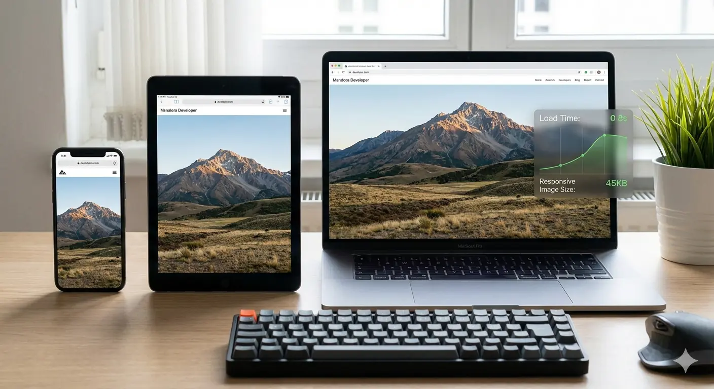
Responsive images are images that adapt automatically to different screen sizes, resolutions, and device capabilities. Instead of serving one fixed image to everyone, the browser is offered multiple image options and intelligently selects the best one for the user's device.
The goal is simple: smaller devices receive lighter images, larger or high-DPI screens receive sharper ones, and no user downloads more data than necessary. This balance between visual quality and page speed is what makes responsive images essential in any modern web workflow.
Why Responsive Images Matter in Modern Web Design
The web is mobile-first. Google indexes and evaluates pages primarily from a mobile perspective, and users increasingly browse on phones, tablets, and hybrid devices. Images often account for the largest portion of page weight, which means poor image handling directly harms load times and user experience.
Without responsive images, mobile users may download desktop-sized images — wasting bandwidth and slowing down pages significantly. Over time, this leads to higher bounce rates, worse Core Web Vitals scores, and weaker search visibility. The direct relationship between image decisions and LCP, CLS, and TTI scores is covered in depth in the guide to how image optimisation improves Core Web Vitals.
Regular Images vs Responsive Images
A regular image uses a single file for all devices. While CSS can visually resize it, the browser still downloads the full file regardless of screen size — so a 2MB desktop image is downloaded in full even on a 375px mobile viewport.
Responsive images provide multiple image sources. The browser chooses the most appropriate one based on screen width, resolution, and layout context. This results in faster loads, better visual clarity, and improved performance metrics across every device type.
How Browsers Choose the Right Image
When a browser encounters a responsive image, it evaluates several factors: viewport width, device pixel ratio (DPR), image layout size, and sometimes network conditions. Using this information, it selects the most efficient image file available. This decision happens automatically and invisibly to users, making responsive images a powerful behind-the-scenes optimisation that requires no JavaScript.
Understanding the srcset Attribute
The srcset attribute is the core mechanism behind responsive images. It allows developers to specify multiple image files with defined widths or resolutions so browsers can choose the best match.
<img
  src="image-800w.jpg"
  srcset="image-400w.jpg 400w,
          image-800w.jpg 800w,
          image-1200w.jpg 1200w"
  sizes="(max-width: 600px) 100vw, 50vw"
  alt="Descriptive text">
The sizes attribute tells the browser how much screen space the image will occupy in the page layout, preventing unnecessary downloads of oversized images. Using srcset without sizes is one of the most common beginner mistakes — the browser is forced to guess layout width and typically over-downloads.
Responsive Images for Mobile Devices
Mobile images require special consideration. Smaller screens and slower networks mean that file size matters more than it does on desktop. Responsive images ensure mobile users receive lightweight images without sacrificing clarity on high-density displays.
Properly implemented responsive images dramatically reduce mobile load times, improve engagement, and lower data usage — all of which feed directly into the mobile usability signals Google evaluates during crawling. Getting the dimensions right for each image type and use case is covered in the practical guide to best image sizes for blogs in 2026.
Using the <picture> Element
The <picture> element gives developers more control when resizing alone is not enough. It allows different image versions based on media conditions, which is especially useful for art direction — where you want a portrait crop on mobile and a wide landscape crop on desktop.
<picture>
  <source media="(max-width: 600px)" srcset="mobile-image.jpg">
  <source media="(max-width: 1200px)" srcset="tablet-image.jpg">
  <img src="desktop-image.jpg" alt="Descriptive text">
</picture>
This approach ensures the most appropriate image composition is shown on each device, not just the most appropriately sized one.
Common Beginner Mistakes
A frequent mistake is using srcset without the sizes attribute, forcing browsers to guess and often load larger images than necessary. Another common issue is relying only on CSS resizing, which controls how an image is displayed but does nothing to reduce the file actually downloaded.
Developers also frequently overlook modern formats like WebP and AVIF, which deliver significantly better compression and work seamlessly with responsive image implementations — the same srcset syntax supports next-generation formats without any additional complexity. A broader list of the image optimisation decisions that consistently harm production performance is covered in top image optimisation mistakes developers make.
Responsive Images and SEO
Responsive images improve SEO indirectly by enhancing page speed, mobile usability, and Core Web Vitals. Faster pages tend to rank better and retain users longer. Well-written alt text improves accessibility and helps images appear in Google Images. For a broader understanding of how image decisions translate into ranking signals, see why image optimisation is critical for SEO in 2026.
Responsive images themselves are not direct ranking signals, but the performance gains they enable — lower LCP, stable CLS, reduced bounce rate — are.
Accessibility Best Practices
Every responsive image should include descriptive alt text. Screen readers depend on alt attributes to communicate image context to visually impaired users. Responsive images don't change accessibility requirements, but they make consistency and clarity even more important since the same alt text serves users on every device and screen size.
Impact on Core Web Vitals
Images heavily influence Largest Contentful Paint (LCP) and Cumulative Layout Shift (CLS). Responsive images reduce LCP by minimising the file size of the image the browser needs to render, and prevent CLS by defining explicit width and height dimensions in advance so the browser can reserve the correct layout space before the image loads.
This makes responsive images a critical element of any performance-focused development workflow.
When to Use Responsive Images
Responsive images are essential for blog hero images, featured images, product photos, and any content visual that makes a significant contribution to page weight. Small UI icons, decorative elements, and SVG graphics typically don't need srcset. Prioritise images that are large, visually important, and loaded above the fold — these are the images that directly determine your LCP score.
Frequently Asked Questions
Do responsive images help SEO?
Yes. They improve performance, mobile usability, and engagement metrics that influence rankings indirectly through Core Web Vitals and bounce rate signals.
Is srcset required?
It is the most widely supported and simplest method for resolution-based responsive images. The <picture> element and modern frameworks like Next.js Image offer alternatives, but srcset remains the baseline implementation.
Are responsive images necessary for small websites?
Yes. Performance benefits apply regardless of site size, and the implementation cost — adding srcset and sizes to existing <img> tags — is low relative to the gains.
Conclusion
Responsive images are no longer optional. They are a baseline requirement for fast, accessible, and search-friendly websites. By understanding how srcset, sizes, the <picture> element, and browser selection work together, beginners can implement responsive images confidently and correctly.
MeloTools helps you prepare the correctly sized and formatted source files for every responsive image tier — converting and compressing images for free directly in the browser without uploads or logins. Start simple, test across devices, and treat image optimisation as an ongoing performance practice.