How Developers Can Optimize Images for Faster Websites
Introduction: Why Image Optimization Still Breaks Fast Websites
Image optimization for developers is no longer a "nice-to-have" performance tweak. It is one of the highest-impact frontend optimizations available today, yet it is still responsible for many slow websites, poor Lighthouse scores, and failing Core Web Vitals.
In real-world audits, images frequently account for 40–70% of total page weight. Even well-built applications with modern JavaScript frameworks struggle with frontend performance when image workflows are inconsistent or poorly defined.
As one Chrome performance engineer put it:
"Most performance regressions we see in Lighthouse are not caused by JavaScript. They're caused by images that were never optimized for the layout they ship in."
This guide is written for developers who want predictable, repeatable image optimization workflows that improve frontend performance, boost Lighthouse score, and scale across teams without guesswork.
How Images Impact Frontend Performance Metrics
Before optimizing anything, developers need to understand how images affect real performance signals.
Images directly influence:
- Largest Contentful Paint (LCP) when hero images or banners are involved
- Cumulative Layout Shift (CLS) when dimensions are missing
- Time to Interactive (TTI) when decoding and rendering is delayed
- Total page weight, which affects mobile speed and low-end devices
In performance audits, image-related issues consistently appear as top contributors to low Lighthouse scores, especially on content-heavy and ecommerce pages. The MeloTools AI-Ready Image Optimization guide explains how modern search engines evaluate these signals and why predictable image behavior matters more than ever.
Image Formats Developers Should Use (and Avoid)
Choosing the right format is the first decision in image optimization for developers.
JPEG and PNG
JPEG remains suitable for photographs but often ships with unnecessary quality overhead. PNG should be reserved for images requiring transparency or pixel-perfect clarity, not for large photos.
WebP
WebP is now widely supported and offers significantly smaller file sizes compared to JPEG and PNG. For most frontend projects, WebP should be the default delivery format.
AVIF
AVIF delivers even better compression than WebP but has higher encoding cost. It is ideal for performance-critical images when browser support and build pipelines allow.
For a deeper look at how format decisions affect both speed and SEO, the MeloTools guide on AI-ready image optimization covers how search engines interpret format choices as part of broader page quality signals.
Compression: Quality vs File Size Tradeoffs
Compression is where many developers either over-optimize or under-optimize.
Excessive compression leads to visible artifacts. Insufficient compression leads to unnecessary page weight. The goal is not the smallest possible image but the smallest image that preserves perceived quality.
Developers should compress images before they ever reach production, use consistent quality targets across the project, and avoid manual, one-off compression decisions.
For teams considering browser-based compression as part of their workflow, the MeloTools guide on client-side image compression safety explains the privacy benefits, technical tradeoffs, and when this approach is the right choice.
Responsive Images Explained for Developers
Responsive images are a core part of frontend performance, yet they are often misunderstood.
Using a single large image for all devices wastes bandwidth on mobile and slows page speed. Developers should rely on srcset and sizes to deliver appropriately sized images.
<img
  src="image-800.webp"
  srcset="image-400.webp 400w, image-800.webp 800w, image-1600.webp 1600w"
  sizes="(max-width: 768px) 90vw, 800px"
  alt="Optimized product image">
If responsive images are new to your team, the MeloTools beginner guide to responsive images covers srcset, the <picture> element, mobile-first sizing, and common implementation mistakes in plain language.
Lazy Loading Images Without Breaking UX
Lazy loading images improves page speed by deferring offscreen images. However, developers often misuse it.
Best practices include:
- Lazy load below-the-fold images only
- Never lazy load the LCP image
- Always define width and height to prevent CLS
Native lazy loading using loading="lazy" is now supported by modern browsers and should be the default.
Misapplying lazy loading is one of the most common causes of unexpected Lighthouse regressions. The MeloTools complete beginner guide to lazy loading covers where to apply it safely, what to avoid, and how to validate your implementation across real devices.
Image Dimensions and Layout Stability
Missing image dimensions are one of the most common causes of CLS.
Developers should always define width and height attributes, use aspect-ratio in CSS where layouts are fluid, and avoid injecting images dynamically without reserved space.
This single change often improves Lighthouse scores immediately, especially on mobile. It pairs directly with responsive image implementation — both are covered in the MeloTools responsive images guide.
Build-Time Image Optimization for Developers
Relying on runtime optimization alone is risky. Build-time optimization ensures consistency.
Popular approaches include image optimization during CI/CD, framework-level image components, and static generation with pre-sized assets. However, build pipelines must be predictable — unclear tooling leads to inconsistent outputs and developer confusion.
When build pipelines aren't an option or teams need immediate feedback during development, browser-based preprocessing is a practical alternative. The MeloTools guide on client-side image compression safety explains when this fits into a production-grade workflow.
Browser-Based Image Optimization for Developer Workflows
Many teams now use browser-based tools to preprocess images before they reach the repository.
This approach keeps images private, reduces reliance on third-party servers, and gives developers immediate feedback without infrastructure dependencies.
The MeloTools image converter supports WebP and AVIF conversion, batch processing, and compression — entirely in the browser with no uploads required. For teams evaluating this approach, Is Client-Side Image Compression Safe? outlines how to verify a tool is genuinely processing locally and what risks remain regardless of architecture.
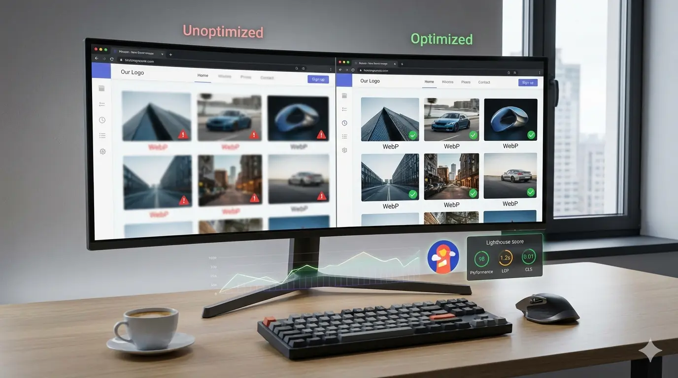
How Image Optimization Improves Lighthouse Score
From a Lighthouse perspective, optimized images reduce LCP by shipping smaller hero images, improve CLS by enforcing dimensions, and lower Total Blocking Time by reducing decode overhead.
In audits, image fixes often produce the fastest Lighthouse improvements with the lowest engineering effort.
Many of the issues that surface in Lighthouse are not new — they are recurring patterns. The MeloTools guide on top image optimization mistakes developers make documents the most common ones, including lazy loading the LCP image, shipping design exports directly, and skipping responsive markup.
SEO Benefits Beyond Performance
Image optimization for developers also impacts SEO directly.
Optimized images improve crawl efficiency, appear more frequently in image search, support better accessibility with descriptive alt text, and reduce bounce rates due to faster loads.
As search engines become more capable of interpreting images contextually, the relationship between image quality and search visibility deepens. The MeloTools guide on AI-ready image optimization explains how AI-powered search systems evaluate images beyond file size — including context alignment, placement, and consistency with surrounding content.
For the technical SEO fundamentals of image indexing, alt text, filenames, and structured data, see the MeloTools Technical SEO Guide for Images.
A Practical Developer Workflow Example
A repeatable workflow might look like this:
- Designers export images at maximum quality
- Developers convert and compress images using the MeloTools browser-based converter — no uploads, no accounts
- Images are resized to match layout breakpoints
- Responsive variants are generated using
srcset - Images are committed with SEO-friendly naming conventions
- Lighthouse is used to validate performance before deployment
For blog-heavy sites and content teams, sizing decisions matter as much as format choices. The MeloTools guide on best image sizes for blogs provides practical dimensions for featured images, inline content images, and responsive breakpoints.
Common Mistakes Developers Still Make
Despite better tools, common issues persist: shipping original design exports, relying on CDNs without preprocessing, lazy loading critical images, and ignoring mobile-first constraints.
These patterns are well-documented. The MeloTools breakdown of top image optimization mistakes shows why these errors recur even on well-maintained projects and how to build workflows that prevent them.
When Developers Should Use CDNs
CDNs help with delivery, not optimization.
A CDN does not fix poor source images, does not choose the correct dimensions automatically, and does not replace responsive markup.
Use CDNs after images are already optimized, not before. This is especially relevant as AI-powered CDN tools emerge — the MeloTools analysis of whether AI will replace image optimization tools explores what automation can and cannot replace in a developer's image workflow.
Why Image Optimization Is a Process, Not a Skill
The biggest insight from high-performing teams is this: image optimization failures are usually process failures.
When workflows are documented, automated, and enforced, performance remains stable even as teams grow.
This philosophy runs throughout the MeloTools content library — most clearly in the AI-ready image optimization guide, which argues that consistency and predictability are the qualities that matter most as search continues to evolve.
Final Thoughts
Image optimization for developers is one of the highest ROI improvements you can make to frontend performance.
By choosing the right formats, compressing intelligently, implementing responsive images, using lazy loading correctly, and building repeatable workflows, developers can dramatically improve Lighthouse scores without sacrificing visual quality.
Fast websites are not built by accident. They are built by teams that treat image optimization as a core part of frontend engineering, not an afterthought.
If you want faster websites, better SEO, and fewer performance regressions, start with your images — and start with workflows your whole team can follow.