How to Make Images Load Faster on Your Website
If your website feels slow and you cannot figure out why, images are almost certainly the cause. Images are the single largest type of file most websites load, and they are also the most neglected. A photograph exported directly from a phone camera, uploaded to a website without any changes, can easily weigh 4 to 6 megabytes. That one image takes longer to load than everything else on the page combined.
The good news is that image loading optimization does not require technical skills or expensive software. Most of the fixes on this list take under five minutes each and produce immediate, measurable improvements to page load time.
This guide explains how to diagnose whether your website is slow because of images, and then gives you seven specific steps to speed up website images starting from the highest-impact actions.
Is Your Website Slow Because of Images? How to Check in 60 Seconds
 Before making any changes, confirm that images are actually causing the slowness. Open your website in Chrome and follow these steps:
Go to pagespeed.web.dev, enter your website address, and click Analyse. Wait for the results to load. In the Opportunities section, look specifically for three items: "Serve images in next-gen formats," "Properly size images," and "Efficiently encode images." If any of these appear, images are a confirmed performance problem on your site.
Each item shows you a potential time saving in seconds. A page showing 2.4 seconds of potential savings from image optimisation is a page that would load more than twice as fast after those fixes are applied. That improvement translates directly to lower bounce rates, better search rankings, and more visitors who actually see your content.
If you want to go deeper, Google Search Console also shows Core Web Vitals data under the Experience section, including Largest Contentful Paint, which measures how long the biggest visible element on your page takes to load. For most websites, the LCP element is a hero image or featured photograph.
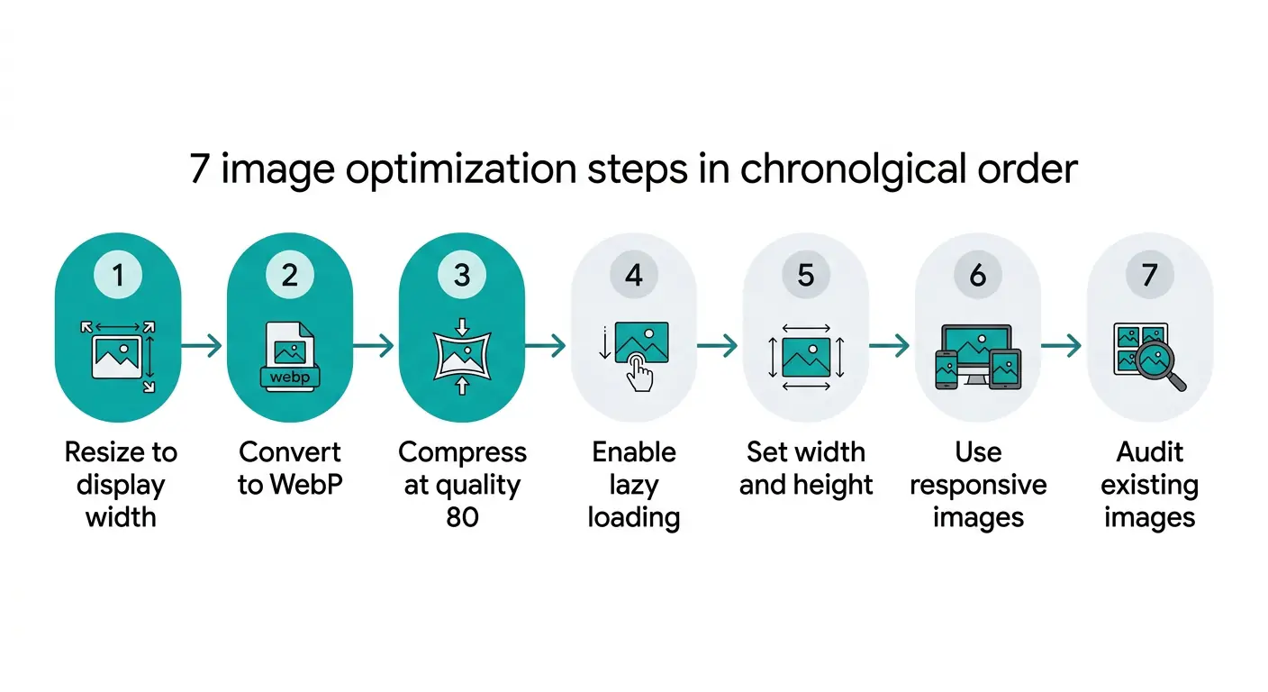
Step 1: Resize Images to Their Actual Display Size Before Uploading
This is the single highest-impact change available and it costs nothing. Most people skip it entirely.
When you export an image from a camera, phone, or design tool, the file is created at the full resolution of the device that produced it. A modern iPhone photograph is 4032 by 3024 pixels. A website blog post image is typically displayed at 800 to 1200 pixels wide. Every pixel beyond the display width is data that transfers over the network and is immediately discarded by the browser.
Resizing a 4032-pixel image to 1200 pixels before uploading removes approximately 91 percent of the pixel data. The image looks identical on screen because the browser was never displaying those extra pixels to begin with. The file size drops from 4 to 6 megabytes to 300 to 600 kilobytes before any compression is applied.
Practical resize targets for common web contexts:
- Blog post featured images: 1200 pixels wide
- In-content images: 800 to 1000 pixels wide
- Hero images (full-width banners): 1600 to 1920 pixels wide
- Thumbnails and previews: 400 to 600 pixels wide
- Product images (e-commerce): 800 to 1000 pixels wide
Resize the image to the maximum width it will ever be displayed at on your website, not to the viewport width. If your blog column is 760 pixels wide, resize to 1200 pixels (to cover 2x retina screens) rather than 760 pixels.
Step 2: Convert to WebP Format
If your website is still serving JPEG or PNG images as the primary format, switching to WebP is the second most impactful single action available for faster image loading website performance.
WebP is a modern image format developed by Google that produces files 25 to 35 percent smaller than equivalent JPEGs and 50 to 70 percent smaller than equivalent PNGs at the same visual quality. A 400KB JPEG becomes approximately 270KB as a WebP. A 1.2MB PNG graphic becomes approximately 400KB. No visible quality difference at normal screen sizes.
WebP is supported by Chrome, Edge, Firefox, Safari, and Samsung Internet, which together cover approximately 96 to 97 percent of all web traffic. For the remaining 3 to 4 percent on older browsers, the HTML picture element delivers a JPEG fallback automatically, so no visitors see broken images.
Converting images to WebP takes under 30 seconds per image using MeloTools image converter. The converter runs entirely in your browser. No file uploads, no account required. Drag your JPEG or PNG onto the JPG to WebP converter or PNG to WebP converter, download the result, and upload the WebP file to your site instead.
For even better compression on performance-critical images like hero images and featured photographs, the JPG to AVIF converter produces files 40 to 55 percent smaller than JPEG.
Step 3: Compress Images Before Uploading
Resizing reduces pixel count. Compression reduces the file size of the pixels that remain. Both steps together produce the smallest possible file for the given display dimensions.
The key point about image compression is that quality loss is not inevitable. At quality settings between 75 and 85, WebP compression discards data that is genuinely below the threshold of human visual perception. A photograph compressed to quality 80 looks identical to the uncompressed original when viewed at normal screen sizes.
The practical targets for compressed web images:
- Hero images and full-width banners: under 200KB
- Blog post featured images: under 150KB
- In-content images: under 100KB
- Thumbnails: under 40KB
- Product images: under 120KB
If your images are consistently above these targets, use the MeloTools image compressor to reduce them. Select the Balanced preset (quality 80) as the starting point. Check the before and after preview, confirm the image looks sharp, then download and replace your existing files. For a detailed explanation of exactly how compression works without damaging quality, the complete guide to image compression without quality loss covers every variable.
Step 4: Enable Lazy Loading for Below-the-Fold Images
Lazy loading stops the browser from downloading images that are not yet visible on screen. Instead of loading every image on the page simultaneously when a visitor arrives, the browser only downloads images as the visitor scrolls toward them.
For a blog post with 10 images, a visitor who reads only the first two sections never needs the other 8 images loaded. Without lazy loading, all 10 images download on arrival. With lazy loading, only the visible images download, and the rest load only if and when the visitor reaches them.
Adding lazy loading to images in WordPress is a setting, not code. In WordPress, go to Settings, Media, and enable lazy loading if your theme supports it. Most modern themes apply it automatically to all images below the fold. If you manage your own HTML, add loading="lazy" to every img tag except your hero or header image.
One important rule: never apply lazy loading to the first visible image on the page, particularly your hero or banner image. That image needs to load as fast as possible because it is what visitors see first. Lazy loading it actively delays the most important content on the page.
The lazy loading beginner guide covers the full implementation with specific instructions for WordPress, custom HTML, and common CMS platforms.
Step 5: Set Image Dimensions to Prevent Layout Shift
This step does not make images load faster in isolation, but it makes your website feel faster to visitors. When a browser does not know how big an image will be before it loads, it cannot reserve the correct space on the page. As images load, they push content downward, causing visible page jumping called layout shift.
Layout shift makes a website feel slow and unreliable even when the actual load time is acceptable. It also directly affects your Google Core Web Vitals score under a metric called Cumulative Layout Shift, which is a confirmed ranking factor.
In HTML, setting width and height attributes on every img tag tells the browser the image dimensions before the file downloads. The browser reserves the correct space immediately, and the page appears stable even while images are still loading. In WordPress and most CMS platforms, these attributes are set automatically when you add images through the media uploader.
<img src="blog-image.webp" width="800" height="533" loading="lazy" alt="descriptive alt text">
If you are uploading images at the correct dimensions from step 1, width and height attributes simply reflect those dimensions. No calculation required.
Step 6: Use Responsive Images to Serve the Right Size for Each Device
A desktop image served to a mobile phone wastes bandwidth and increases load time on a network that is often slower than a home broadband connection. Responsive images solve this by serving a smaller file to smaller screens.
The principle is straightforward. You create the same image at multiple widths (for example, 400px, 800px, and 1200px). The browser downloads whichever size fits the device it is running on. A phone with a 390px screen downloads the 400px version. A desktop with an 800px content column downloads the 800px version for standard screens or the 1200px version on a retina display.
In WordPress, responsive images are generated automatically when you upload a correctly sized source file. The CMS creates multiple size versions and writes the srcset markup. You do not need to create the variants manually. The key is uploading the correct source size from step 1, because WordPress scales down from the original. If you upload a 400px image, WordPress cannot create a 1200px version from it.
For custom HTML implementations or developers building without a CMS, the responsive images srcset guide covers the full picture element and srcset attribute syntax with working code examples.
Step 7: Audit Existing Images Already on Your Site
The previous six steps apply to new images you upload going forward. Your existing images may already be causing the slowness you noticed. A one-time audit finds and fixes the images that are currently dragging your site down.
The fastest way to audit existing images is through PageSpeed Insights. Run a report on your slowest pages (homepage, most-visited blog posts, product pages). In the Opportunities section, click on "Properly size images" and "Efficiently encode images." Both expand to show the specific image URLs that are causing problems, along with the exact file size and the potential savings from fixing each one.
For each flagged image, follow this workflow: download the current image from your site, run it through the MeloTools image compressor, convert to WebP if it is still in JPEG or PNG format, resize if the displayed dimensions are significantly smaller than the file dimensions, then re-upload and replace the existing image. Update the src attribute in your CMS to point to the new file.
A site with 20 to 30 blog posts and a slow score on PageSpeed Insights can typically be brought into a passing range by fixing the 5 to 10 largest offending images. The 80 to 20 rule applies here. A small number of very large images is almost always responsible for most of the total image payload.
For the relationship between image load times and actual business metrics including conversion rates and bounce rates, the data on how slow images affect conversions covers the research in detail.
How Much Faster Can Your Site Get?
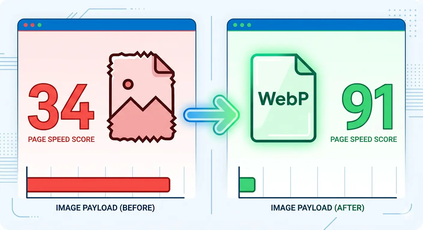
The results from image loading optimization are not subtle. Applying steps 1 to 3 (resize, convert to WebP, compress) to a page with 8 to 10 standard blog images typically produces:
- Total image payload reduced from 3 to 5MB to 400 to 800KB, a reduction of 80 to 85 percent
- PageSpeed Insights score improvement from the 30 to 50 range to the 70 to 90 range for mobile
- LCP improvement from 4 to 6 seconds to 1.5 to 2.5 seconds
- Bounce rate reduction of 20 to 30 percent based on industry data at comparable load time improvements
None of these results require a developer, server configuration changes, or a paid plan. They require applying the three-step workflow to each image before uploading. MeloTools provides the conversion and compression tools free in your browser for both formats, with no file size limits that affect typical web images.
Frequently Asked Questions
What is the fastest way to make images load faster?
The fastest method combines three steps applied before upload: resize the image to its actual display width, convert from JPEG or PNG to WebP format, and compress at quality 80. These three steps together typically reduce image file size by 70 to 90 percent with no visible quality loss. Use MeloTools to convert and compress in your browser at no cost, with no file uploads.
Why is my website slow because of images specifically?
Images are typically the largest files on any webpage by a significant margin. A single unoptimised photograph can weigh more than all other page assets combined. Common causes include uploading images at camera resolution rather than display size, using PNG or JPEG instead of WebP, skipping compression entirely, and loading all images on page arrival instead of using lazy loading. Run PageSpeed Insights on your URL to see exactly which images are the problem.
Does converting to WebP reduce image quality?
WebP at quality 80 produces output that is visually indistinguishable from the original JPEG or PNG at normal screen viewing sizes. The compression discards data below the threshold of human visual perception. The result is a file 25 to 70 percent smaller with no difference visible at the display sizes used on websites.
Do I need technical skills to speed up website images?
No. Resizing can be done in any photo editor including free tools like Preview on Mac and Photos on Windows. Converting to WebP and compressing both take under 30 seconds per image using MeloTools in a browser tab. Lazy loading is enabled through WordPress settings. No code, no server access, and no developer required for the most impactful steps.
How do I know which images are slowing my site down?
Go to pagespeed.web.dev, enter your website URL, and click Analyse. In the Opportunities section, expand "Properly size images" and "Efficiently encode images." Both list the specific image files causing problems with their current sizes and the estimated savings from optimising each one. Start with the largest offenders first.