Image Optimization for Mobile-First Websites
Why Mobile Image Optimisation Is Critical Today
Mobile image optimisation is no longer optional. With mobile-first indexing as the default standard, search engines primarily evaluate the mobile version of a website when determining rankings. If images slow down rendering, cause layout shifts, or consume unnecessary bandwidth, the entire page experience suffers — and Google registers that as a negative quality signal regardless of how well the desktop version performs.
On mobile devices, performance constraints are stricter: smaller screens, variable network speeds, and limited processing power demand precision. Every kilobyte of unnecessary image data translates directly into slower load times, higher bounce rates, and lost rankings. Mobile image optimisation ensures images load quickly, render correctly, and enhance user experience without compromising visual quality. The full picture of why image optimisation is critical for SEO in 2026 applies with even greater force in a mobile-first indexing environment.
Understanding Mobile-First Indexing and Image Impact
Mobile-first indexing means Google evaluates your site as a mobile user would. If your images are oversized, uncompressed, or improperly formatted, rankings may decline even if the desktop version performs well. Mobile speed is directly influenced by image weight — since images typically represent the largest share of page size, optimising them delivers the fastest measurable performance improvement available without changing any other aspect of the page.
What Is Mobile Image Optimisation?
Mobile image optimisation is the process of preparing images specifically for mobile devices by reducing file size, choosing efficient formats, enabling responsive images, and ensuring layout stability. It combines compression, format selection, dimension control, and delivery optimisation to improve load speed and user experience on smartphones and tablets across varying network conditions.
How Images Affect Mobile Speed
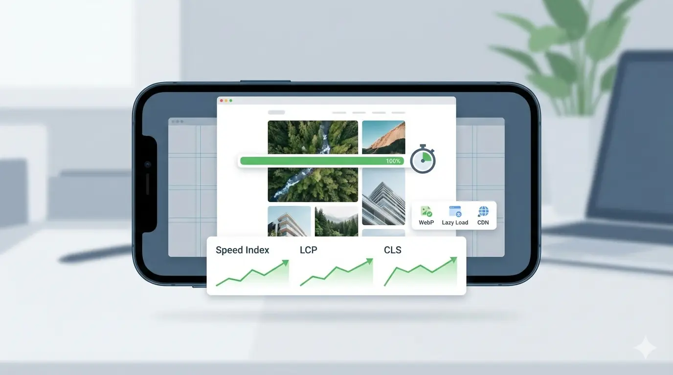
Images influence mobile speed in three major ways: file size, rendering priority, and layout stability. Large images increase Time to First Byte and Largest Contentful Paint (LCP). Improperly sized images block rendering. Missing dimension attributes cause Cumulative Layout Shift (CLS). When mobile speed decreases, bounce rates increase, engagement drops, and search visibility weakens. The direct mapping between each of these image decisions and specific Core Web Vitals thresholds — including what scores trigger ranking changes — is documented in the guide to how image optimisation improves Core Web Vitals.
Choosing the Right Image Formats for Mobile
Format selection significantly impacts mobile performance. JPEG works for photography but produces heavy files at higher quality settings. PNG should be reserved for images requiring transparency. WebP and AVIF offer superior compression and should be prioritised for mobile-first websites — WebP delivers 25–35% smaller files than equivalent-quality JPEG, and AVIF achieves even greater compression for the most performance-sensitive pages. Serving next-generation formats reduces payload size while maintaining visual clarity, and both formats are now supported across all modern mobile browsers without fallback requirements.
Compression Strategies for Mobile Devices
Compression should balance size reduction and quality retention. Lossy compression is effective for large hero images where slight quality reduction is imperceptible to users at mobile screen densities. Lossless compression suits diagrams, UI screenshots, and images with flat colour regions. A practical workflow includes compressing images before upload using dedicated tools rather than relying entirely on CDN automation — this ensures predictable results and direct control over mobile speed outcomes rather than variable results from automated pipelines.
Implementing Responsive Images Correctly
Responsive images are essential for mobile-first websites. The srcset and sizes attributes tell browsers which image file to download based on the device's screen width and pixel density, preventing mobile users from downloading desktop-sized assets. Proper implementation reduces data usage and improves rendering speed significantly — a 1600px image served to a 390px mobile screen is downloading roughly four times the necessary data. The full implementation guide — covering srcset, sizes, the <picture> element, and common beginner mistakes — is in the complete guide to responsive images.
Defining Image Dimensions to Prevent Layout Shift
One consistently overlooked aspect of mobile image optimisation is specifying explicit width and height attributes on every image element. When dimensions are not defined, browsers cannot allocate space before the image loads, leading to layout shifts that knock text and interactive elements around as the page renders. These shifts directly harm CLS scores and user experience on mobile, where layout instability is more disruptive than on larger screens with more visual context.
Lazy Loading for Performance Gains
Lazy loading delays offscreen images until the user scrolls near them, reducing initial page weight and accelerating first render time. For content-heavy mobile pages, lazy loading significantly improves perceived performance by letting the browser focus network resources on content the user can actually see. The complete beginner guide to lazy loading images covers the implementation in detail — including the most critical rule: above-the-fold images and the LCP candidate must never be lazy loaded, as delaying them directly worsens the metric that matters most.
Image CDN and Delivery Optimisation
Content Delivery Networks enhance mobile image optimisation by serving assets from geographically closer servers, reducing round-trip time on constrained mobile connections. Modern CDNs also offer automatic format conversion, resizing, and compression at the edge. Integrating CDN-level optimisation ensures consistent global performance and supports scalable growth — particularly important for content websites publishing large volumes of new images regularly.
Optimising Alt Text for Mobile SEO
Alt text remains essential in mobile-first indexing. Descriptive alt attributes provide context to search engines and accessibility tools. Effective alt text explains the image clearly and relates it naturally to the surrounding content without repetitive keyword insertion. On mobile, where images frequently load after text, accurate alt text ensures the page communicates its full meaning to search engines even when images are still loading.
Structuring Images for AI and Multimodal Search
Search engines increasingly analyse visual content alongside text using multimodal AI systems. Proper placement of images near relevant headings improves contextual understanding. Captions that explain diagrams enhance both accessibility and AI extractability. Understanding how images appear in AI search results — including the visual recognition, contextual placement, and semantic association layers AI systems use to evaluate images — is increasingly important for mobile SEO strategy, since mobile-optimised pages are the ones AI systems are most likely to surface.
Common Mobile Image Optimisation Mistakes
Common mistakes include uploading oversized hero banners, ignoring next-generation formats, skipping pre-upload compression, failing to implement responsive images, and neglecting layout stability through missing dimension attributes. Another frequent error is compressing images excessively, resulting in noticeable quality degradation that undermines user trust even while improving load speed. Balanced optimisation — targeting the lowest file size at which quality degradation is not visibly perceptible — is the correct approach.
Measuring Performance Improvements
Track improvements using Core Web Vitals metrics. Monitor LCP, CLS, and overall mobile speed scores in Google Search Console and Lighthouse. A meaningful reduction in total image payload — typically achievable by switching formats and adding responsive images — usually produces a visible improvement in LCP within one or two crawl cycles.
Workflow for Content Teams
An effective mobile image optimisation workflow includes image sizing guidelines per content type, compression before upload as a mandatory step, standardised naming conventions, alt text requirements, and CDN configuration. Establishing internal standards ensures consistency across publishing teams. Automation tools can streamline this process, but a clear pre-publish checklist prevents the most common errors from reaching production.
Final Thoughts
Mobile image optimisation sits at the intersection of performance engineering and content strategy. By combining compression, modern formats, responsive images, structured metadata, lazy loading, and intelligent delivery, mobile-first websites can significantly improve speed, engagement, and rankings. MeloTools provides free, browser-based compression and format conversion to handle the pre-upload step — ensuring every image reaches your CMS already optimised before any CDN or build pipeline processes it further. The top image optimisation mistakes developers make covers the full list of production failures this workflow is designed to prevent.