How Faster Images Improve User Experience
Introduction
Images are one of the most influential elements on any website. They shape first impressions, communicate meaning instantly, and guide users through content. However, images are also one of the biggest contributors to slow load times. When image performance is poor, user experience suffers, engagement drops, and bounce rates rise.
Understanding how faster images improve user experience is essential for modern UX optimisation. Image performance directly affects how users perceive speed, trust a website, and interact with its content across devices. This guide explains the relationship between image performance and UX, why speed matters psychologically and technically, and how optimised images improve website engagement at scale.
What Is Image Performance in UX?
Image performance in UX refers to how efficiently images are delivered, rendered, and displayed during a user's interaction with a website. It is not only about file size — it also encompasses timing, responsiveness, and visual stability.
From a UX perspective, image performance includes how quickly images appear on screen, whether images block other content from loading, how images adapt to different devices and screen sizes, and whether images shift layout elements during load. Good image performance supports smooth, predictable, and fast experiences. Poor image performance creates delays, frustration, and distrust — even if the rest of the site is technically sound.
Image Performance UX vs Perceived Speed
Actual load time and perceived speed are not always the same. Users judge speed based on what they see, not on technical metrics alone. When images load progressively, appear instantly above the fold, and do not cause layout shifts, users perceive the site as fast. When large images load late or suddenly push content down the page, users perceive slowness — even if the total load time is within acceptable limits.
Optimising image performance UX is about improving what users feel, not just what servers deliver.
How Faster Images Impact User Experience
Faster First Impressions
Images are often the first visual elements users notice. Fast-loading images help establish credibility and professionalism immediately. Slow or broken images create doubt and increase abandonment. The direct relationship between image load behaviour and whether users stay or leave — including the specific UX factors that drive bounce rate — is covered in depth in the guide to how images affect bounce rate and website engagement.
Reduced Cognitive Load
When images load smoothly, users can focus on content rather than waiting or anticipating what will appear next. Faster images reduce mental friction and help users process information more easily.
Improved Interaction Readiness
Slow images can block interactivity, especially on mobile devices. Optimised images allow users to scroll, tap, and interact sooner, improving perceived responsiveness.
Higher Website Engagement
When users are not distracted by delays, they are more likely to read, scroll, and explore. Faster images directly support higher website engagement and longer session duration.
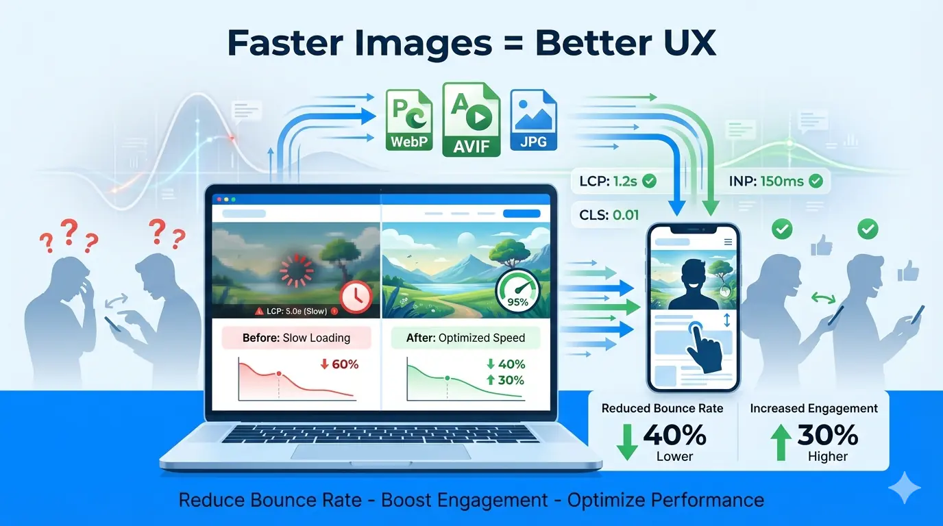
Image Performance and Core Web Vitals
Core Web Vitals are user-centric performance metrics used by search engines to evaluate page experience. Image performance plays a major role in all three key metrics. The guide to how image optimisation improves Core Web Vitals maps each image decision to specific metric thresholds — making it straightforward to prioritise which images to fix first for the greatest UX and ranking impact.
Largest Contentful Paint (LCP)
LCP measures how quickly the largest visible element loads. On most pages, this is an image. Optimised images significantly improve LCP and perceived speed.
Cumulative Layout Shift (CLS)
CLS tracks unexpected visual movement. Images without defined dimensions cause layout shifts when they load, displacing text and interactive elements. Proper sizing and responsive image handling prevent this entirely.
Interaction to Next Paint (INP)
INP reflects responsiveness. Heavy images can delay interaction readiness, especially on slower devices. Efficient image delivery improves interaction timing and makes pages feel snappy even on constrained hardware.
The Psychology of Speed and Visual Perception
Users associate speed with quality, trust, and reliability. Faster images signal competence and care, while slow visuals suggest neglect or poor engineering. Research consistently shows that even small delays affect behaviour — users are more likely to abandon slow-loading pages, visual delays reduce perceived value, and faster visual feedback increases satisfaction and return visit rates.
On mobile devices, where bandwidth and processing power vary significantly between users, image performance UX becomes even more critical to delivering consistent, equitable experiences.
Common Image-Related UX Problems
Many UX issues stem from poor image handling rather than overall site architecture. Common problems include oversized image files, outdated image formats, loading all images at once instead of progressively, serving desktop images to mobile devices, missing width and height attributes, and images blocking critical content rendering. These are also among the most consistently found issues in production performance audits — the top image optimisation mistakes developers make covers the full list with specific fixes for each.
UX Optimisation Through Faster Images
Image Compression
Reducing file size without sacrificing quality is foundational. Proper compression lowers load time while maintaining the visual clarity that supports user trust and content comprehension.
Modern Image Formats
WebP and AVIF provide significantly better compression than traditional JPEG or PNG, delivering faster images with comparable or superior quality. WebP is the reliable modern baseline with near-universal browser support; AVIF offers the greatest compression efficiency for the most performance-sensitive pages.
Responsive Image Delivery
Serving different image sizes based on device resolution ensures users only download what they need. The complete guide to responsive images covers srcset, sizes, and the <picture> element — the three tools that together prevent desktop-sized images from loading on mobile viewports.
Lazy Loading
Lazy loading defers off-screen images until the user scrolls near them, improving initial load speed and reducing unnecessary data usage. The complete beginner guide to lazy loading images explains how to implement it correctly — including the most critical rule: above-the-fold images and the LCP candidate must never be lazy loaded.
Content Delivery Networks (CDNs)
CDNs deliver images from geographically closer servers, reducing latency and improving global performance consistency — particularly for audiences spread across multiple regions.
Real-World UX Examples
E-commerce: Faster product images reduce bounce rate, increase browsing depth, and improve conversion confidence. Shoppers expect immediate visual feedback when evaluating products.
Blogs and content platforms: Optimised images improve reading flow and reduce distraction, keeping users engaged through longer articles and higher scroll depth.
SaaS dashboards: Fast-loading interface visuals improve usability, reduce operational frustration, and support the high interaction frequency that dashboard users require.
In all cases, image performance UX directly influences user satisfaction and long-term retention.
Image Performance, SEO, and AI Search Visibility
Search engines increasingly prioritise user experience signals. Faster images improve crawl efficiency, reduce bounce rate, and increase dwell time — all of which feed into how Google evaluates page quality. AI-powered search engines and answer systems also favour content that loads quickly and presents information clearly. Understanding how images appear in AI search results — and the specific technical and contextual signals AI systems evaluate — is increasingly important for teams that want their visual content surfaced in generative responses.
Measuring Image Performance for UX
To improve image performance UX, measurement is essential. Key indicators include image load timing, LCP contribution, CLS caused by images, and mobile performance metrics. Common tools include Google PageSpeed Insights, Lighthouse, Web Vitals reporting in Search Console, and browser DevTools performance audits. Interpreting results through a UX lens — asking which delays are most visible to real users — ensures optimisation efforts align with actual experience rather than abstract scores.
Best Practices Checklist for Faster Images
- Compress images before upload, not after
- Use modern formats — WebP as baseline, AVIF for maximum efficiency
- Serve responsive image sizes with
srcsetandsizes - Define explicit
widthandheighton every image element - Implement lazy loading for all below-the-fold images
- Never lazy load the LCP candidate or above-the-fold visuals
- Use caching and CDN delivery for global performance consistency
- Regularly audit image performance after publishing new content
Conclusion
Image performance UX plays a decisive role in how users experience speed, quality, and trust on a website. Faster images reduce bounce rate, improve website engagement, and support long-term UX optimisation goals. By treating images as performance assets rather than static decorative elements, teams can deliver smoother, faster, and more satisfying experiences across every device and network condition. MeloTools provides free, browser-based compression and format conversion to make optimising images before upload a frictionless step in any content or development workflow.